
As 2022 was a busy year, I only participated in a few community projects. However, as the year started closing out, I felt compelled to do at least one #MakeoverMonday. The initiative played a considerable role in my Data Visualization growth story, and I’ll always be grateful to Eva Murray and Andy Kriebel for creating it.
For this week, we had to re-viz a map from the Guardian showing the proportion of people in the UK who follow no religion:
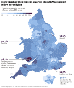
My thoughts on the original: It’s an awesome map visualization. It’s by the Guardian, so there is no surprise here.
It has:
- A color palette to help see the differences across the UK Districts on the map
- A descriptive title that speaks to its content
- Easy-to-read labels and annotations that highlight notable observations on the map
I decided to keep the map and enhance it, ending up with this:
Approach
With this viz, I aimed to answer the questions:
- What proportion of people in the UK doesn’t follow any religion at the district level?
- What does this look like at the regional level?
- What areas have the highest proportion of people who follow no religion?
- What was the change in religious affiliation across religions in the past decade?
Additionally, the visualization (viz) has interactive capabilities allowing the user to explore the data differently.
Finally, aesthetics and presentation play a massive role in data viz perception and understanding. Therefore, a beautifully designed visual is integral to my approach.
Layout, colors, text, and the application of functional design concepts are considerations in each viz.
Creating the Visuals
THE DATA
Grab the data and view the original article here if you want to build your own.
You’ll find an excel file with data points and a shape file to help map things out if you want to go in this direction.
You’ll also need to connect to the data file and join it with the shape file in Tableau.
NOTE: I’ll be brief as we move through the different components of this. Please open up the workbook and explore things there for a more effective learning experience.
THE COLORS
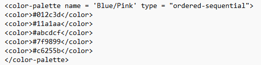
The first thing I did was add a new palette to my Tableau repository.
A diverging palette (rather than a sequential one) was a good change, as it enables us to see better the areas with the highest rates of people with no religious affiliation.
To create the palette, I played around in Adobe Color. Next, I added five colors to my Tableau repository as a sequential palette.
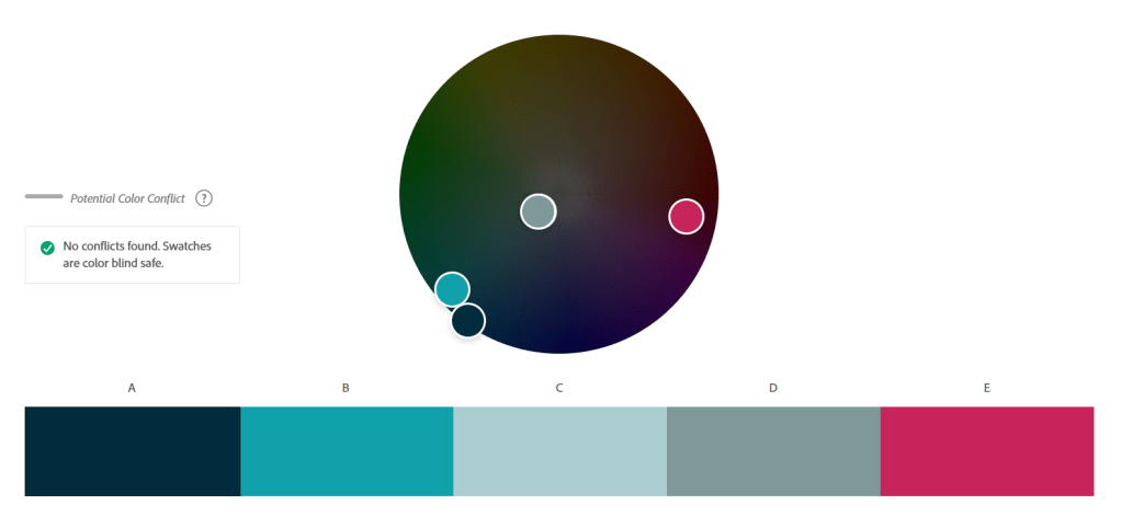
You can read more about creating color palettes using Adobe, in a previous post I wrote here.
Here is the code snippet that was added to the Tableau repository.
To add your custom palette in Tableau:
- Go to: C:\Users\Name\Documents\My Tableau Repository
- Open “Preferences.tps” with your text editor of choice like word or notepad
- Paste your code snippet like the one shown above, in between the <preferences> and <\preferences> tags
CALCULATIONS
The computations needed to present the analyses in the viz are:
- The number of people with no religious affiliation in 2011 and 2021:

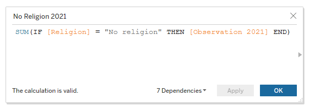
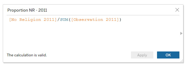
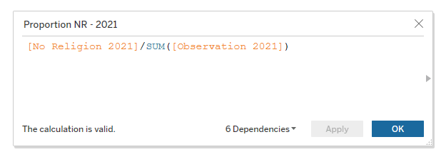
- The percentage of people with no religious affiliation in 2011 and 2021:
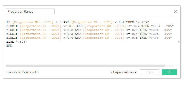
- A range to explore the distribution of people with no religious affiliation in 2021
After calculating the percentage of people with no religious affiliation and exploring the local authority districts, I noticed it ranged from 10.6% to 55.2%. So I used a formula to break them out:
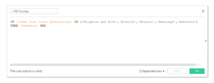
- The map points to show places where more than 50% of people claim no religious affiliation in 2021
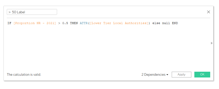
- Labels for places where more than 50% of people claim no religious affiliation in 2021
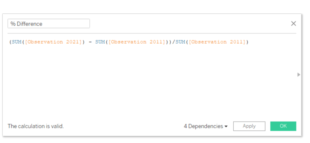
- % Difference in Affiliation from 2011 – 2021
CREATING THE VIEWS
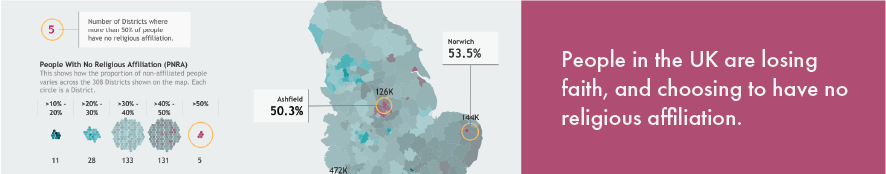
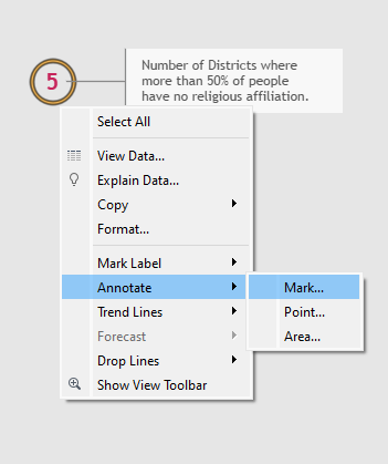
View 1: Districts where more than half of everyone has no religious affiliation.

This view is a simple circle outline created using a placeholder (sum (0)) in Tableau.
You can read about these nifty things called placeholders in Tableau here and here.
We then double-click in the marks pane, type “5,” and change it to a label.
Technically, for accuracy, we should use a formula to count the number of districts with >50%, but since it’s such a low number and our data is static, we can get away with doing this here.
Next, we type quotation marks (“”) and also change them to a label. This allows us to type whatever text we like as a label or annotation.
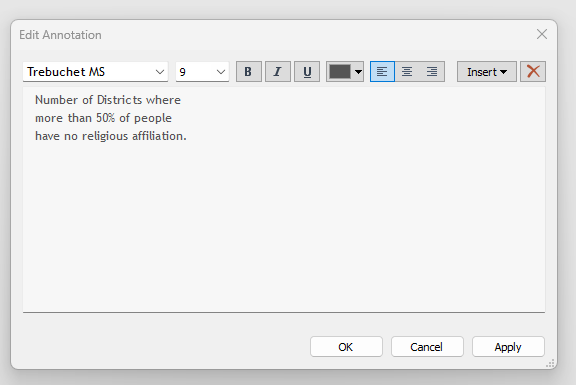
To add the annotation: Right-click the circle > Click “Annotate” > “Mark”
You can type whatever you like in the text box. Tableau also lets us leverage fields in the view when creating the annotation. In this case, I typed out simple text.
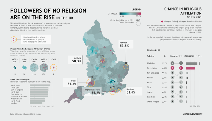
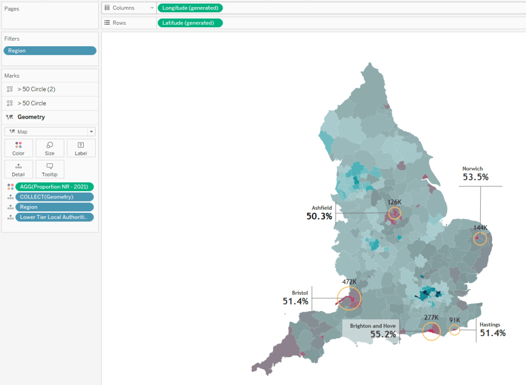
View 2: The main map
This is a map with 3 Layers:
- Layer 1 shows the proportion of people with no religion.
- The color scale helps show the distribution.
- Layer 2 uses yellow circles to show the places where the proportion is more than 50%.
- These circles are annotated.
- Layer 3 shows the same thing as layer 2 but the circles were made transparent.
- We used them to label the 2021 census population of the 5 districts being highlighted.
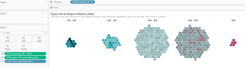
View 3: The distribution of people with no religious affiliation across the local districts.
The aim here is to provide a view that shows in what ranges the districts fall.
Looking at it, we see that most districts fall within the >30 to 50% range.
We also clearly see the five districts where more than 50% claim no religious affiliation.
View 4: People with no religious affiliation at the regional level

This is a plain view that shows the data at a regional level.
I leveraged Tableau highlight actions to allow the user to highlight the regions on the map.
This way, we can see the proportions at the regional level and how the make-up of people looks across the districts in that region.
We can see East Midlands highlighted in the action shot below:
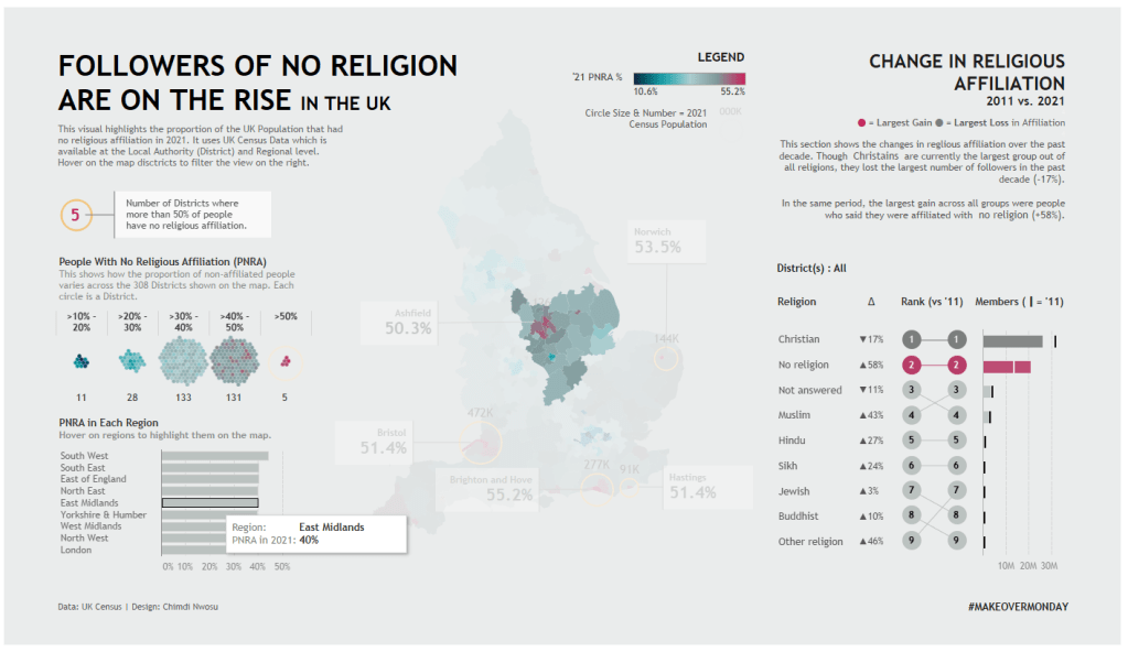
View 5: Change in religious affiliation since 2011
This view is a combination of three sheets lined up side by side in a horizontal container:

It shows:
- The change in affiliation in each religion
- The difference in rank based on members (2011 vs. 2021)
- The number of members in 2011 and 2021
This view also allows exploring these changes across each district by hovering on the map districts to filter the rank view. This interactivity is implemented by using Tableau filter actions.
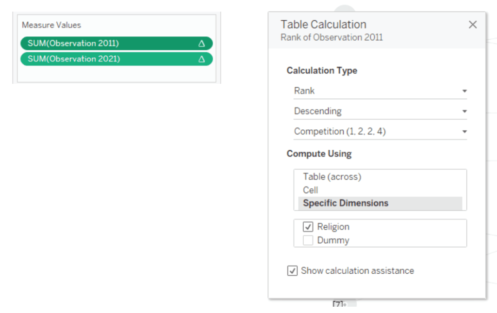
All three views should be easy to decipher, so please explore each in the workbook. In case it isn’t apparent, the view that shows the rank uses a rank table calculation on the measures for the 2011 and 2021 membership counts.
Conclusion
That covers everything in terms of visuals created – Hopefully, it was straightforward enough.
Regarding text, we can see a bit of text in this viz, and it covers:
- Introduction
- Instructions on interacting with the views
- Annotations on relevant views
- A brief overview of some of our findings.
Overall, #MakeoverMonday is about strategizing the best way to visualize insights. Sometimes that means re-doing a viz, and other times, it involves enhancing it. The approach chosen is usually subjective and thus can’t be defined in a single way. As long as you can justify why you’ve done what you did, then you should be just fine.
I hope this has been helpful. If you want to check out more #MakeoverMondays, you can check out the initiative here, and if you have any thoughts or questions, please feel free to connect on Twitter or LinkedIn.
Happy Vizzing,
Chimdi
