

Despite knowing about Adobe’s free color tool, Adobe Color, I only recently began to pay serious attention. Inspired by CJ Mayes’ 29 Colour Palettes post, I decided to dig deeper into the tool because I love colors and believe using them correctly makes a big difference in our Data visualizations (Data Viz).
It turns out that it’s very handy and can potentially be a one stop shop for all your Data Viz color needs depending on your goals.
In this blog post, I’ll share three ways Adobe Color can help simplify the process of getting color palettes for our Tableau visuals:
1. Create Your Own Palette
2. Check for Accessibility
3. Explore, Modify, and Use Theme-Based Palettes
Create Your Own Palette
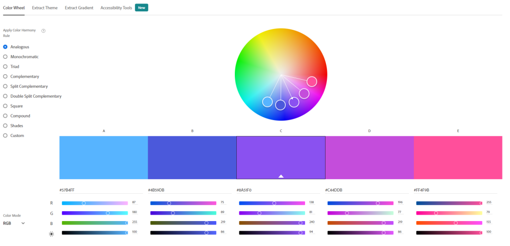
Option 1 – Our first option is the Color Wheel tab which lets us create any five-color palette based on color harmony rules. This option resides on the CREATE tab.


Color harmony helps choose colors that work well together aesthetically, and the picture below shows the available options in Adobe Color.
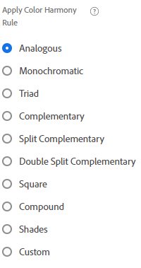
Though knowledge of color theory isn’t necessary to use this, it helps. For example, if we need a palette with two main colors, we could jump to the Complementary section since it focuses on using two main colors to generate a palette.
The default color mode used is RGB, and since this is for data viz, there’s no need to change that.
This excellent article on colorexplained.com can help get you up to speed on the main types of color harmony if you’re interested.
There’s no section on Compound color or Double Split Complementary. However, during my research, I discovered that Compound is usually interchanged with Split Complementary and Double Split Complementary is two pairs of Complementary colors. So we’re still fully covered with the article.
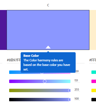
The color wheel creates palettes using a base color that sits at the center of the palette by default, and we can move it to any position in the five-color palette. It’s the color with the white triangle underneath, and we select the base by entering a hex code or using sliders beneath the color box.
Adobe uses the base color and the selected harmony rule to generate the palette.
Sometimes the palettes come out a bit brighter and more saturated than we’d like. To reduce saturation and brightness, we drag the color circles closer to the center to help dim them a bit.

If you’d like to understand more about saturation, contrast, and other factors to consider when creating and choosing colors to use in data viz, I highly recommend this amazing article by Lisa Charlotte Muth on Datawrapper titled How to Pick More Beautiful Colors for your Data Visualizations. It exposes the reality that choosing colors isn’t easy and provides helpful suggestions to simplify the process. It’s a valuable resource if you frequently plan to create color palettes from scratch.
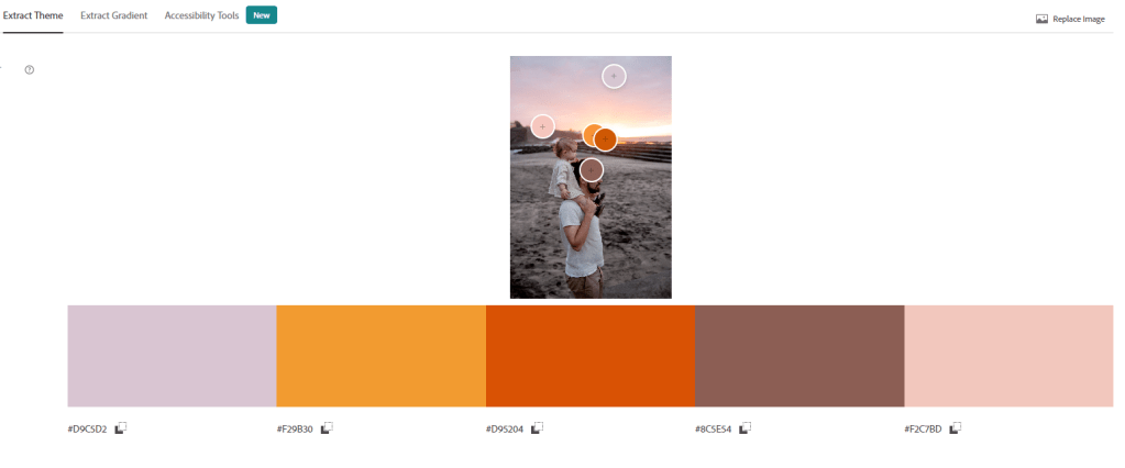
Option 2 – Our second option is the Extract Theme tab which helps us extract colors from an image.
To use it, simply click the Extract Theme tab and upload the picture you’d like to extract from.


A remarkable thing about “beauty” is that we can’t always create it from scratch, but we often intuitively recognize it around us. That’s why I believe this part is handy. Found a picture online that’s visually appealing? Import it and extract its colors. Did you see a beautiful view while outside? Snap it with your phone, upload it to your computer, and then extract its colors. The possibilities are endless.
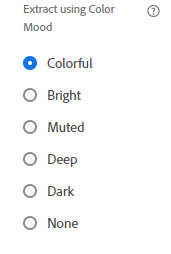
Adobe extracts five colors based on the color mood selected, and we can override this using the color circles to highlight what parts of the picture we want to extract.
These are the available color moods:
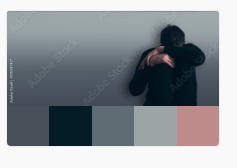
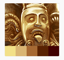
Here are a few color moods extracted using a picture from Pexels.com. The last screenshot is a pastel-like palette I created with minor adjustments in the tool.


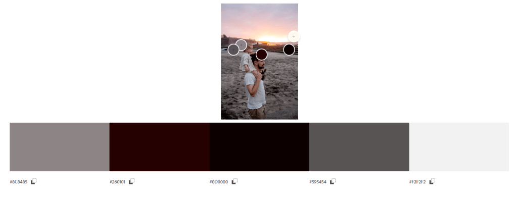


As seen above, Adobe provides many options for color extraction, which we can easily override if needed. In addition, using this method is faster and less overwhelming because we’re working with a limited number of colors instead of a full-color palette.
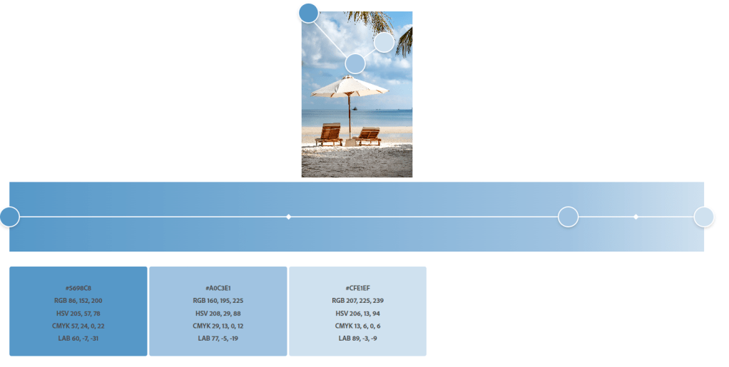
Option 3 – Our third option is the Extract Gradient tab, which helps extract gradients from an image. It works exactly like the previous section but extracts gradients from the picture.
To adjust the color blends, we can set how many gradient stops it uses. It starts out at 2 stops and maxes out at 15.
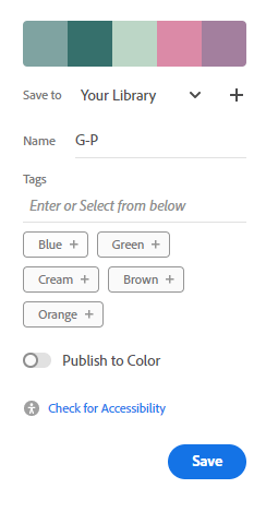
After creating and modifying palettes, we can save them to our library or publish them in Adobe color. A Gmail account is needed to save, after which we can re-edit or download in jpeg and other formats. Publishing to Adobe lets others use the palette we’ve created. Note that the palettes are referred to as “Color Themes” in Adobe
We can do one more thing before or after saving, which leads us to another major resource available through Adobe to help our color creation process.
Check for Accessibility
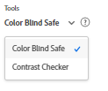
Clicking on the Accessibility Tools tab lets us check our created palette for accessibility regarding color blindness and contrast.
After creating a palette, simply click on the Accessibility Tools tab to see the results in the checker. Ensure the tool is set to Color Blind Safe.
When testing for colorblindness, If the palette tested has no issues, we see a green checkmark telling us there are no issues.


If we end up with issues, it highlights what colors are in conflict and we can adjust as needed.
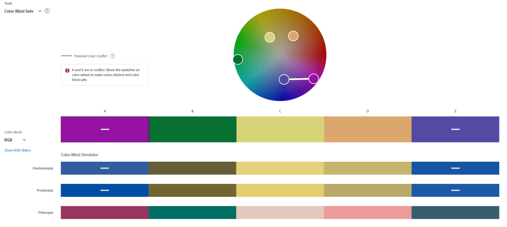

Checking for color blindness in the tool is pretty straightforward, so I encourage you to use it whenever creating your palettes. CJ Mayes highlights another way to use this tool in his 29 Color Palettes blog post. The method involves extracting the colors from a viz using the extractor and then using the Color Blind Safe tool to test for accessibility.
According to colourblindawareness.org, approximately 1 in 12 men and 1 in 200 women are color blind. They may not make up the majority, but they’re more than worthy of consideration when designing our Data vizzes.
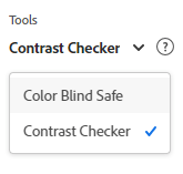
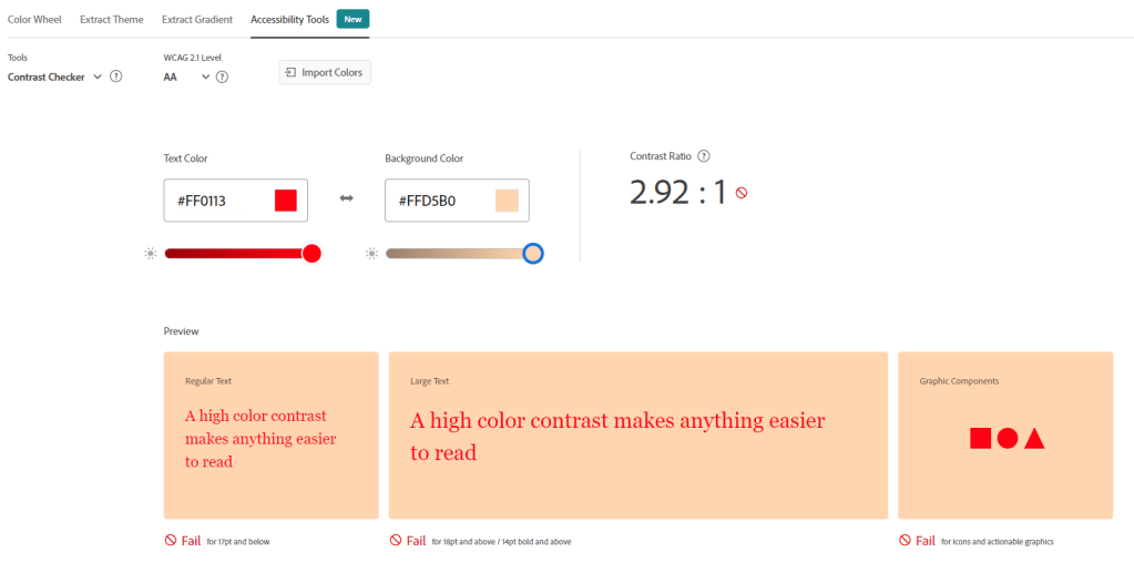
To switch to the Contrast Checker, toggle the dropdown on the left to Contrast Checker .
This section is straightforward and lets us ensure our background and text / object colors work well together. For times when we stick to a light background/dark text or dark background/white text combo, this check may seem unnecessary. However, it becomes essential once we go into full-color mode, with colored text, colored backgrounds, etc.

Our previous two uses of Adobe Color focus on creating our palettes from scratch, but what if we want to find ready-made palettes to use right away? Adobe Color has us covered here too!
Explore, Modify, and Use Theme-Based Palettes
Switching from the CREATE tab to the EXPLORE tab takes us to a different section with the ability to search for color palettes based on moods, base colors, and keywords.


We can borrow palettes and find inspiration from other designers here, and the search function works quite well. The other nice aspect of this is that the palettes are also adjustable, so we can tweak things precisely how we need them to be. The ability to save and download also applies here.
If palettes were extracted from pictures, Adobe displays the picture with the theme. This can help solidify our ideas during theme-based color selection.
Here are examples of what comes up when we search “business“


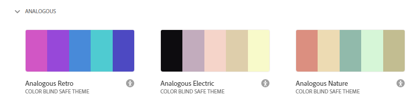
Here are examples of what comes up when we search “depressed“

Here are examples of what comes up when we search “historic”

As we see from these results, If you’re looking for some theme-based or mood-based inspiration, this section works well.
The TRENDS tab is like a continuation of the EXPLORE tab, and it shows collections of palettes based on the current trends across different sectors like Fashion, UI/UX, Graphic Design, and more.


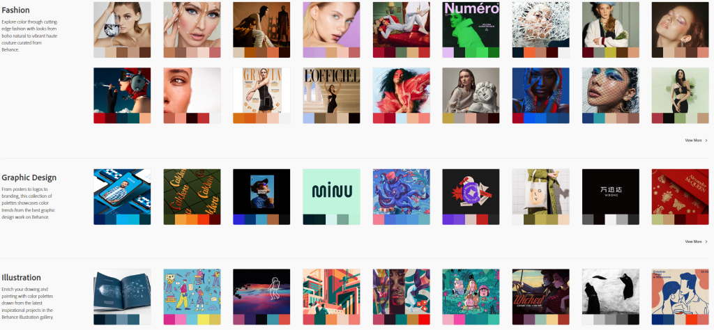
One difference between the TRENDS section and the EXPLORE section is that TRENDS provides more guided exploration, and the palettes displayed change over time as trends evolve. The EXPLORE section would also grow as designers create and publish their themes.
Final Words
Coloring our Data vizzes can be a fun and functional part of the process that allows us to make our insights stand out and shine through. It always deserves to be well thought out, and though it’s not easy, we can all benefit from getting comfortable making good color choices in data viz.
To learn more about how to think about color use here’s that Datawrapper article again: How to Pick More Beautiful Colors for Your Data Visualizations.
Additionally, at the end of CJ’s Blog post, you’ll find links to other resources which also have links to other resources on using color in Tableau. So feel free to dig and see what works for you.
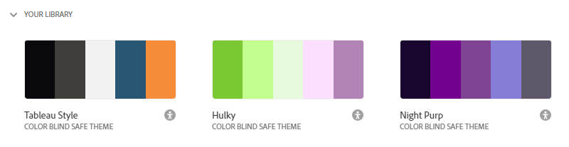
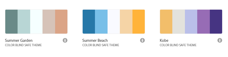
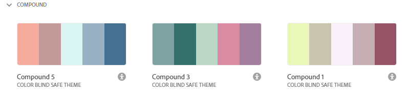
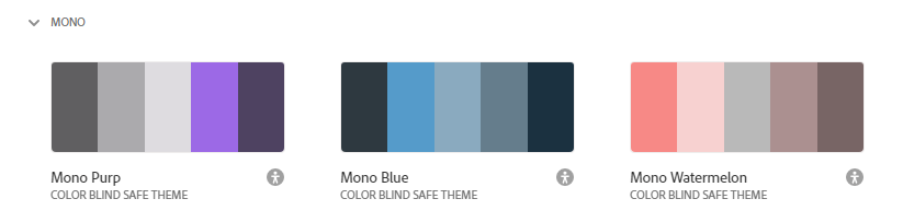
Finally, after writing this post, I updated my Tableau palettes to include the ones I made during my exploration of Adobe Color. There are 40 of them (2 sets for the Shades Group – Categorical and Sequential), and they’re all color-blind safe. The initial plan was to add them to the Datafam Colors Project, but I couldn’t convince myself to go and add them one by one. So, If you’d like to use them, please feel free to download this file and add them to your Tableau preferences file using this method.
Latest Additions to my Tableau Palette


Have any thoughts or feedback you’d like to share? Feel free to drop me a line.
Chimdi

One thought on “Creating Color Palettes Using Adobe Color”