
In this post, we’ll look at how map layers and shapes were used to create the custom house charts in my Build Up Nepal Visualization (viz). Using a similar thought process coupled with imagination and patience, we can create some exciting stuff in Tableau.

This particular viz uses shapes and map layers to create houses that show the different project metrics of the Build Up Nepal project. Be sure to check out the details of this project here.
Design Inspiration
The design inspiration came from this fantastic abstract shapes piece I found online. Sometimes in Data viz, we’re lucky enough to know what we want to do for a project. Other times, looking around for inspiration helps get us going a bit quicker. Regarding where to look for inspiration, that’s a topic for another post.

To avoid going overboard with the length of this post, we’ll focus on recreating the main view that shows the houses. The other parts should be easy enough to unpack by reverse-engineering the workbook – I encourage you to download and explore.
Map Layers Introduction
Tableau’s release of the Map Layers feature in the 2020.4 edition opened a world of new possibilities. We can have many more data layers with map layers, allowing us to enrich our data stories with more information. I consider it my favorite feature, and many people use it differently across the Tableau community.
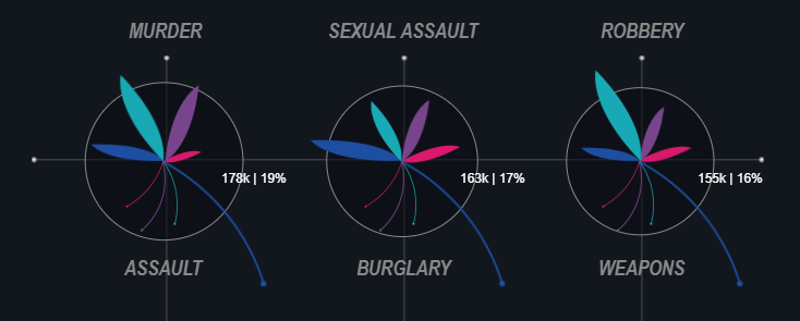
Here are examples to illustrate:


There are many other awesome map layer visualizations to check out, so I’ll put links to them at the end.
Because many blogs have successfully explained how it all works, I won’t go into depth on that area. So instead, here are a few resources to check out for an understanding of the feature:
- Layering Marks in Tableau by Jeffery Shaffer
- Using Layers in Tableau (Webinar) by Adam McCann
- Beyond Dual Axis by Dr. Luke Stanke
After reading one or many of these, it becomes clear that the MAKEPOINT() function is the foundation of map layers. We write MAKEPOINT(latitude, longitude) to use it, and Tableau plots our points based on the values in brackets.
A pattern of usage in the community exposes two main ways we can implement map layers:
- Using measures in our data to plot points in the view. The three blogs referenced above use this method.
- Using shapes and layers to create custom visualizations in Tableau. I used this method in the viz we’re exploring today, and here are snippets showing it in use in some of my previous vizzes:


Leveraging Map Layers to Build Houses
Now that we know which method we’ll be using, how exactly does it work?
We encode measures using shapes rather than putting them in the MAKEPOINT function. This means we need another set of numbers to create our layers for the view.
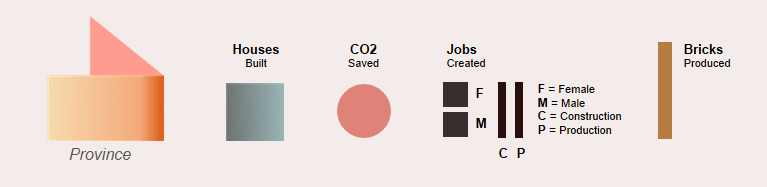
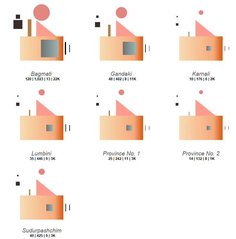
This viz has seven metrics to encode. Therefore, we need nine shapes and layers to build a full house: Seven shapes for our seven measures + two additional shapes because our base for showing province names comprises two layers ( A base and a roof ).

These are our seven measures :

This is the legend showing how the seven items and province names are assigned to the shapes :
To create the full view, we need to:
1. Import our shapes to Tableau
2. Create our calculations and layers using MAKEPOINT( )
3. Add the layers to the view & assign shapes to the layers
4. Add labels to the view
Step 1: Import Our Shapes to Tableau
The two black squares and the peach circle are native to Tableau. Everything else was made in illustrator. Figma or any other free design tool can also be use to make shapes.
The data and shapes can be found here if you want to follow along and replicate the viz.
To add the shapes to Tableau:
1. Open the Documents folder on your computer > Click My Tableau Repository
2. Open the Shapes folder and create a new folder called “Nepal” or whatever you want to call it. If you’ve already downloaded the shapes, move them here, or download them into this new folder.
When you open Tableau, you’ll be able to use the shapes in your viz.
Now we can open Tableau and load the dataset.
Step 2: Create our Calculations
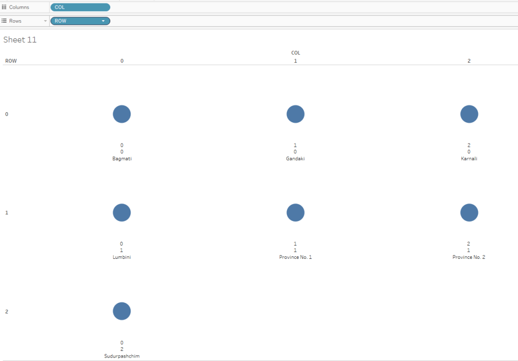
Each Nepali province where houses were built is shown as one house in this viz. I used small multiples to show each province in the view. For this viz, we’ll manually create our row and column values for the view because a table calculation can’t be used as input to MAKEPOINT( ).
Create our Row and Columns to use in building the view:
ROW:
IF [Province Name] IN (“Bagmati Province”,”Gandaki Province”,”Karnali Province”) THEN 0
ELSEIF [Province Name] IN (“Lumbini Province”,”Province No. 1″,”Province No. 2″) THEN 1
ELSE 2
END
We’ve just created three rows with three provinces each on the first two rows, and the last province sits on the third row.
COL:
IF [Province Name] IN (“Bagmati Province”,”Lumbini Province”,”Sudurpashchim Province”) THEN 0
ELSEIF [Province Name] IN (“Gandaki Province”,”Province No. 1″) THEN 1
ELSE 2
END
Here we’ve created three columns with three provinces on the first, and two on the other two.
To test that things are correct, place COL on the columns pane and ROW on the rows pane. Confirm that your view looks like this then clear the view :
Create our Layers
Create the calculation below:
Base : MAKEPOINT(-[ROW],[COL])
NOTE: The minus sign reverses the order of rows because Tableau plots “0” at the bottom of the view, but we need it at the top.


Moving forward, we’ll place all the different house parts on top of the base, with varying offsets in the form: MAKEPOINT([ROW] ± Offset, [COL] ± Offset)
For rows: “+” = shift up, and “-” = shift down
For columns: “+” = shift right, and “-” = shift left
Understanding this relative positioning is key to being able to pull different individual layers together to create a view that consist of any kind of object or shape we like.
The part of this that takes the most commitment is exploring how far or close to place things together in the view. In my experience I’ve had to do this manually every single time. It’s never gotten to a point where it felt bothersome, so if you want to go ahead and experiment, don’t let the thought of completing this manual step deter you.
Now, let’s create our remaining calculations.
Window : MAKEPOINT(-[ROW],[COL]+0.1)

Roof: MAKEPOINT(-[ROW]+0.225,[COL]+0.09)

Bricks Produced: MAKEPOINT(-[ROW]+0.15,[COL]-0.15)

Female Jobs: MAKEPOINT(-[ROW]+0.4,[COL]-0.3)
Male Jobs: MAKEPOINT(-[ROW]+0.3,[COL]-0.3)

CO2 Saved: MAKEPOINT(-[ROW]+0.45,[COL])

Construction Jobs: MAKEPOINT(-[ROW],[COL]+0.3)
Production Jobs: MAKEPOINT(-[ROW],[COL]+0.35)

Step 3: Add the Layers to the View
Now that we have the calculations, it’s time to start building the view.
Before we start, let’s turn off Tableau’s map layer so we only see our layers:
Click Map > Background Maps > None

A – Base Layer
- Change the Marks to Shape and Drag Base into the view
- Drag Province Name onto the Marks Pane
- Click on the Shapes Mark > More Shapes > Click the folder where you have your shapes
- Click on the shape for the base and click Ok

Finally, click on the Size Marks card and drag it to the maximum size.
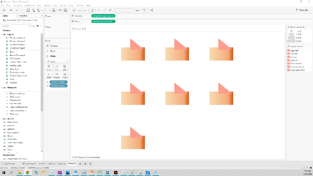
B – Roof Layer (The top of the base)
- Drag Roof into the view to create a new layer
- Drag Province Name onto the Color Marks
- Change the Mark to Shape and assign the roof shape that you imported (the right triangle)
- Adjust the size so that it’s proportional to the base
- If you want to keep the same colors, set the color to hex code “#fe9c8f”. Else choose whatever color you want
- Click the Roof layer and drag it behind the Base layer as shown below
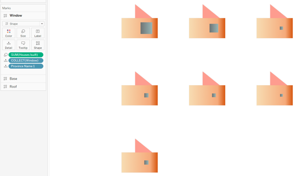
C – Window Layer
- Drag Window into the view to create a new layer
- Drag Province Name onto detail
- Change the Mark to Shape then assign the imported shape used to encode houses built (the shaded square)
- Drag the Houses Built measure onto Size
- Increase the Size, so it’s proportional to the rest of the view
Your view should now look like the view below:
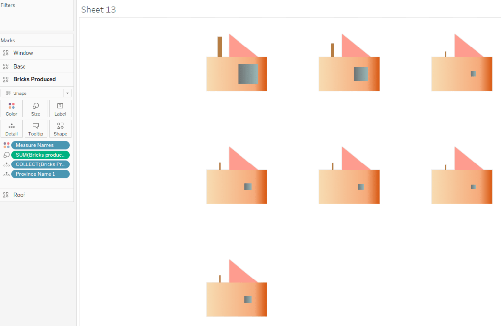
D – Bricks Produced Layer
- Drag Bricks Produced into the view to create a new layer
- Drag Province Name onto detail
- Change the Mark to Shape, then assign the imported shape used to encode houses built (the tall rectangle bar)
- Drag the [Bricks Produced] measure onto Size
- Increase the Size so it’s proportional
- Drag Measure Names onto color, change the color to “#b67d43” or whatever color you choose
- Click this layer and drag it behind the Base layer
Your view should now look like this:
E – CO2 Saved layer
- Drag the CO2 Saved layer into the view to make a new layer
- Drag Province Name onto detail
- Change the Mark to Circle
- Drag the [CO2 saved] measure onto size and increase it until it is proportional
- Change the color to ‘#d9685c’ or whatever color you want
Your view should now look like this:

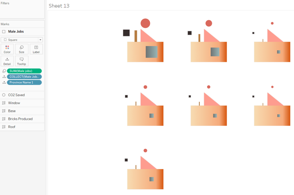
F – Male Jobs layer
- Drag the Male Jobs layer into the view to make a new layer
- Drag Province Name onto detail
- Change the Mark to Square
- Drag the [Male Jobs] measure onto size and increase it until it is proportional
- Change the color to ‘#372e2d’ or whatever color you want
Your view should now look like this:
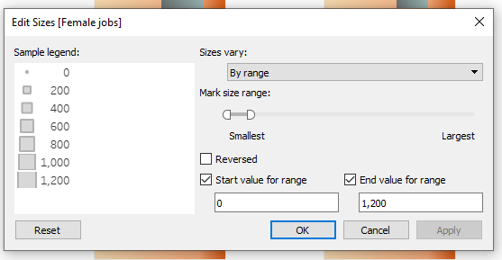
G – Female Jobs layer
- Repeat the steps above using the Female Jobs layer instead of the Male Jobs layer.
Also, use the Female Jobs measure instead of the Male Jobs measure. - Edit the size range of the Male and Female Jobs shapes marks to match – This ensures that the squares are sized proportionally for an accurate visual comparison

H – Construction Jobs layer
- Drag the Construction Jobs layer into the view to make a new layer
- Drag Province Name onto detail
- Change the Mark to Shape and assign the tall vertical bar shape to the layer
- Drag the [Jobs (construction)] measure onto size and increase it until it is proportional
- Change the color to ‘#372e2d’ or whatever color you want
Your view should now look like this:

I – Production Jobs layer
- Drag the Production Jobs layer into the view to make a new layer
- Drag Province Name onto detail
- Change the Mark to Shape and assign the tall vertical bar shape to the layer
- Drag the [Jobs (production)] measure onto size and increase it until it is proportional
- Change the color to ‘#372e2d’ or whatever color you want
- Edit the size range of the Construction and Production Jobs shapes marks to match
Now we have all the shapes assigned to the different layers, and your view should look like this:

Step 4: Add our Labels to the View
- Click the Base layer and replicate the Marks Pane below by dragging the relevant fields onto the Label marks

- Click Label and check “Show mark labels” and edit the label to match the screenshot below:

By now you should see the full view shown below and we’re done!
Conclusion
Hopefully, after creating this many layers, you understand how map layers work. This kind of non-standard visualization likely isn’t something we’d get to present in a work meeting or professional setting. However, it was a fun experiment to learn how map layers work with shapes, and I hope it helps you imagine other ways of exploring and using this incredible functionality in Tableau.
Finally, as promised, here are other great map layers visualizations to dig into:
- Singapore Population, Housing and Infrastructure by Thi Ho
- Movies of the 90’s by Priya Padham
- Fifa Players by CJ Mayes
- Beautiful Business – Pie and Doughnuts Edition by Samuel Parsons
- Pokemon Pokedex (1- 20) of Gen One by Joti Gautam
Got any questions or thoughts you’d like to share? Feel free to reach out and drop me a line.
Chimdi
