Mark Bradbourne created the Real World Fake Data (#RWFD) initiative to provide opportunities for strengthening our business dashboard chops while offering inspiration to the global #datafam community. The first season brought us datasets across different domains, and the goal was simple – design your best business dashboard using the data provided.
It’s back for a second season, and this time around, we’ll be re-designing a series of pre-built Tableau Accelerator Dashboards to “improve accessibility, and usability and ensure that best practices are being employed.”(Mark B. #RWFD, 2022)
For the first challenge, I redesigned the Tableau Call Center Accelerator Expert Dashboard into this.
As with any data visualization project, clearly defined goals help keep us on track and within scope.
Here’s what I intended for this one:
Redesign the publicly available Tableau Accelerator Call Center Dashboard, keeping a few goals in mind:
A clean, easy-to-understand design using Tableau only.
My past business dashboards like this Twitter Dashboard and this Supply Chain Dashboard were all heavily designed using Figma or Illustrator. I decided on a different approach here. The logo is the only non -Tableau component on this Dashboard.
Provide a direct way to understand the state of business.
This was done by highlighting relevant business metrics across the business customers and agents.
Here are the metrics that were analyzed, and points on why they matter to our business:
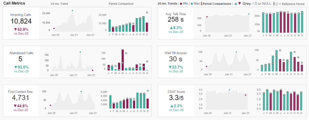
The Chosen Metrics
Overall Call Volume – Incoming calls over specific periods
We analyzed this by Total Incoming calls and by Business Day/Hour.
The first shows overall volume, and the latter helps understand volume at different times. Understanding this could help scheduling efforts to assign resources based on observed patterns in volume over time.
First Call Resolution (FCR) – Successful resolution of a client’s issue on the first call
This helps improve our client experience. Also, if we have a standard Cost per Call (CPC), having a high FCR reduces business costs, improving our bottom line.
Average Handle Time (AHT) – Average time to handle a call from start to finish
We can use this to set benchmarks and KPIs for monitoring agent performance.
CSAT – Helps understand how clients rate our service
CSAT allows clients rate their experience after agent interactions. It’s helpful because this rating depends on the other metrics tracked throughout the exchange.
Average Wait till Answer – How long do clients wait till their calls are answered?
Quicker answered calls mean clients get served faster. Keeping this number low helps improve our CSAT score.
Average Talk Time – How long agents spend on the phone with agents.
Faster resolution is usually good, and assuming we have associated costs for each call, a business may prefer shorter talk time. However, this needs to be balanced as we can’t just hang up to save costs without resolving the client’s issue.
Real World Use Case
When providing insights, the goal is to drive action or change.
To do this, we need pre-defined benchmarks to assess what’s below or above the threshold. Once we have this information, we can decide how to address deficiencies.
For example:
- The AHT metric analyzed by agent tells us how long it takes to resolve client issues
- Using a benchmark, we can analyze which agents are over/underperforming
- The results could then lead us to develop action plans for those below, depending on the outlined business strategy for how we desire our agents to operate
I’m unable to go into all the details of every single use case, but planning out use cases is a crucial part of any dashboard development process. In the real world, our user requirements are what guide this step.
Dashboard Implementation
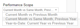
To assess performance, the “Performance Scope” filter lets the user choose the period analysis they want to see: Current Month vs. Previous Month, Current Month vs. Same Period in the previous year, and Current YTD vs. Previous YTD
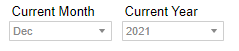
The Current Month and Current Year filter lets the user choose a specific month and year to compare within the specific performance scope.
The views
The Dashboard is split into three views:
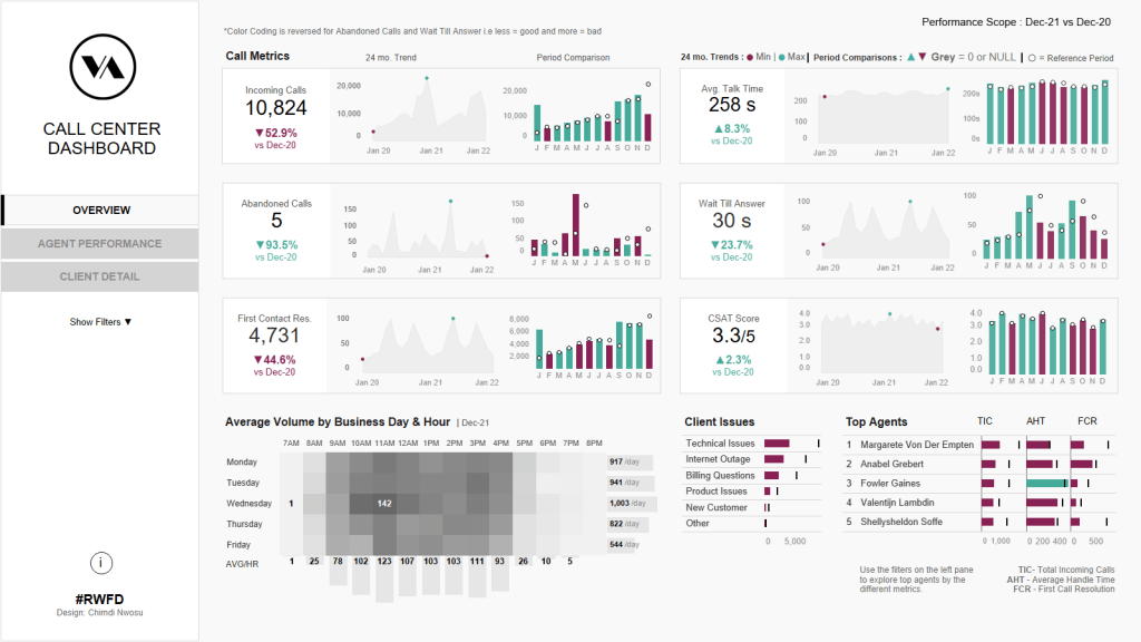
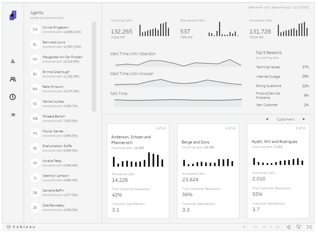
Overview
A high-level summary of our call center business
- Uses our chosen KPIs to display business performance
- Answers questions about the overall state of our business
- Highlights trends over time, and period comparisons based on the performance scope chosen
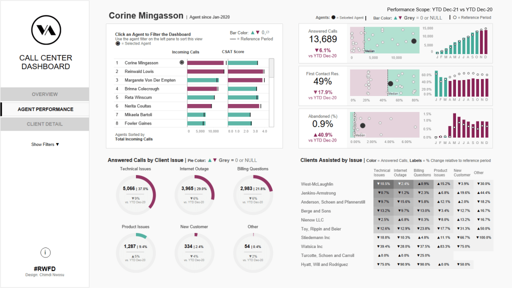
Agent Performance
Say we noticed a drop in CSAT scores at the end of a quarter. We may want to determine what the issue is. The first place we’d probably look at is our agents since they are at the heart of the business.
This section shows:
- Our agents’ performance across the metrics
- It compares agent’s performance against each other
- It shows how performance changed relative to a selected reference period
- It shows the clients assisted by the agent and the related client issues addressed
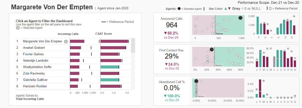
One thing I’d do differently here is allow user’s filter by specific client issues. This would allow a deeper dive into what problems generate lower metric scores and whether some or all our agents are struggling with the same problems.
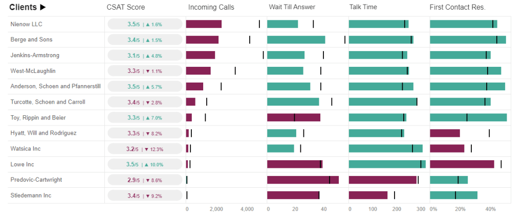
Client Details
Overview of the client experience
- It shows metrics relevant to the client experience – CSAT Score, Average wait till answer, Average talk time, and First Contact Resolution %
- It allows the user filter by day/time of day and client issue.
Design
The KPI layout design was influenced by Ellen Blackburn’s Demo manufacturing dashboard. I really liked her KPI style and implemented something similar:
Ellen’s KPI design
My design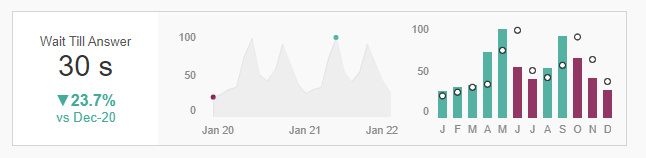
The KPI view is a container with three sheets in it.
The first has the KPI title and number in the title, with the % change and reference period as text marks on the sheet. This allowed us to color the % change based on the change direction, leaving the main number in the title black-colored.
The second sheet to the right of the KPI shows the 24-month trend with two dots to indicate the lowest and highest points on the trend.
The final sheet shows the current period metric using bars, with the comparison period shown using tiny circles. Finally, the bars are colored based on the direction of change relative to the comparison period (Positive or Negative).
Colors
Throughout the dashboard, colors are used to highlight the Min/max values in trends, and the direction of change for period comparisons.

I chose two colors with enough contrast to be differentiable, while also being color blind accessible.
These are the two colors chosen. I found the palette on davidmathlogic.com.
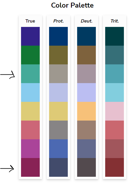
The color contrast was tested using this color blindness simulator.
Everything else was designed in greyscale – A decision influenced by Autumn Battani’s fantastic Call Center Dashboard.
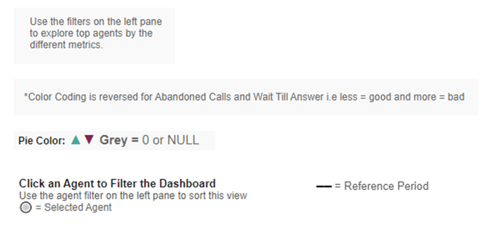
Finally, when designing dashboards and visuals, we don’t want to assume the user knows how to interact or navigate. Placing lots of context for the user helps successfully guide them to the insights provided in the solution.
Examples of context placed throughout the dashboard:
And that’s it! Thanks for making it this far.
Here’s another snapshot showing the agent performance page. You can interact with the dashboard over here. If you have any suggestions or feedback, feel free to drop me a line and I’ll be happy to hear your thoughts.
Chimdi