
Hello Everyone!
For a quick reminder, the #DuBoisChallenge has happened every February since 2021.
To celebrate Black History Month and honor the legacy of W.E.B. DuBois, data viz practitioners and enthusiasts from around the globe come together to recreate DuBois’ hand-drawn data portraits using modern tools like Tableau, R, and more.
Participants are basically given ten portraits and datasets to recreate over ten weeks.
This year, I hosted alongside the founders, Allen Hillery, Anthony Starks, and Sekou Tyler, and the challenge was extended to LinkedIn, Mastodon, Instagram, and Slack.
In general, I had no idea what to expect other than a passion for data viz, DuBois, and history. Ultimately, it was great to see the different approaches used in the entries using the many tools.
Some Participation Statistics
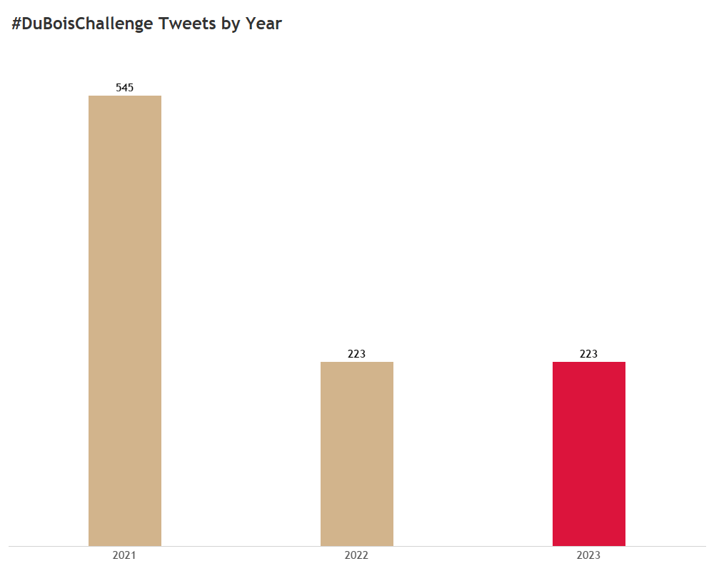
As in previous years, we saw the highest level of participation on Twitter.
There were 217 Tweets with the hashtags #DuboisChallenge or #DuBoisChallenge2023 on Twitter from February to April 17th. If we count the tweets from January, the total number is 223.
Here’s how participation has been over the years:
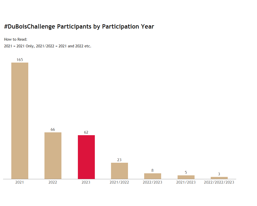
Regarding the participant mix, we were happy to see returning participants from previous years and many new ones too!
The 223 tweets from this year included tweets from 62 new participants, with the rest contributed by returning participants from previous years.
Here’s the distribution of participants over the years:
We have a #DuBoisChallenge Dashboard which you can use to track twitter entries and participants in this and previous years.
SLACK
148 people joined our #challenge-dubois channel on Slack to follow along, with fewer (<10) participating.
The tools here were non-Tableau and included Adobe Illustrator, Charticulator, Power BI, D3, Observable, and more.
We loved seeing everyone’s work and here are some to check out:
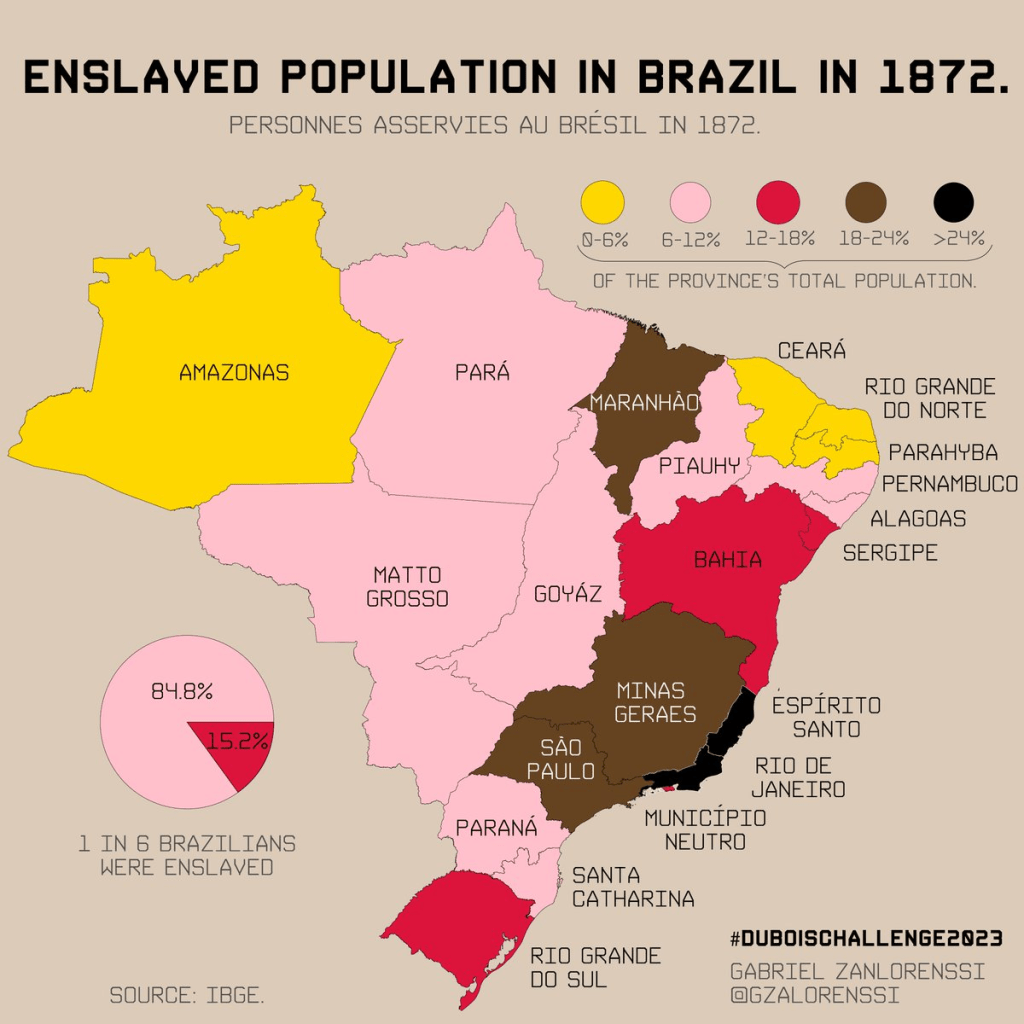
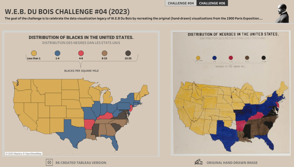
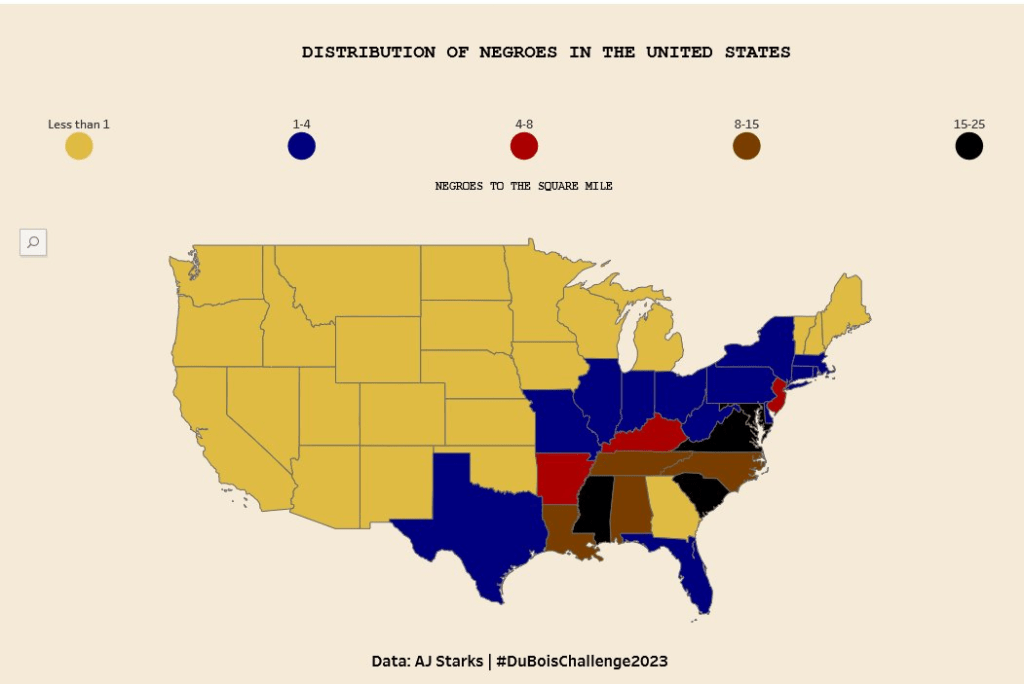
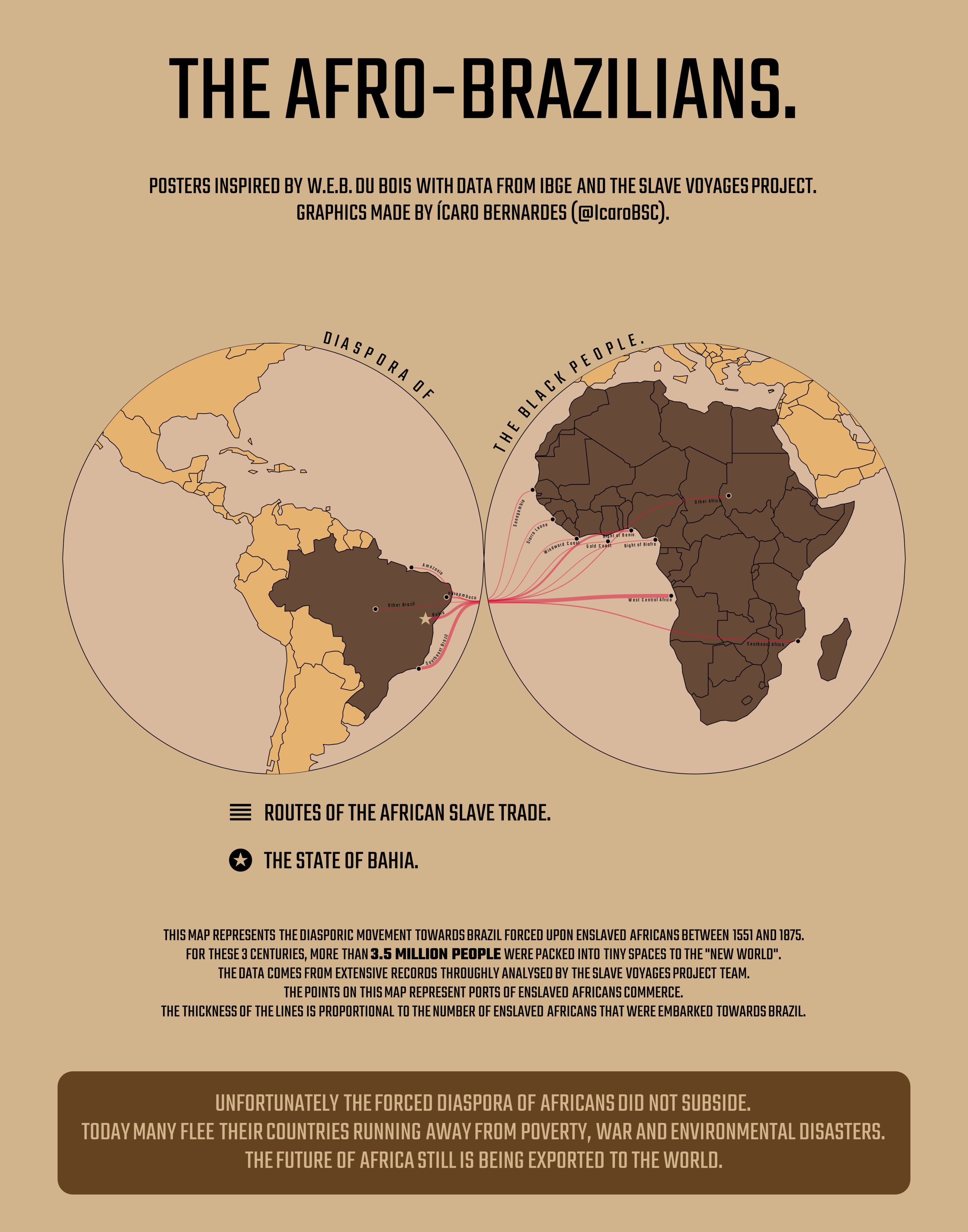
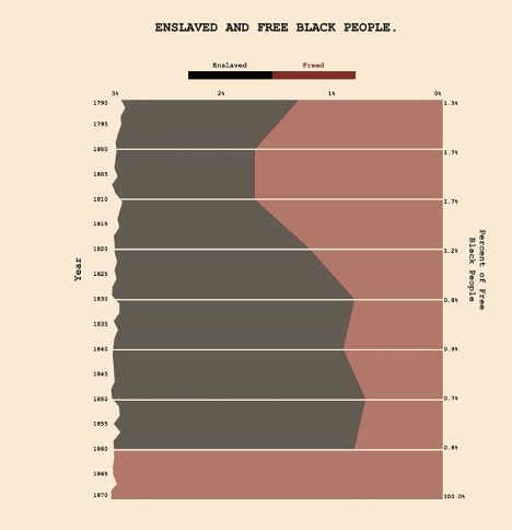
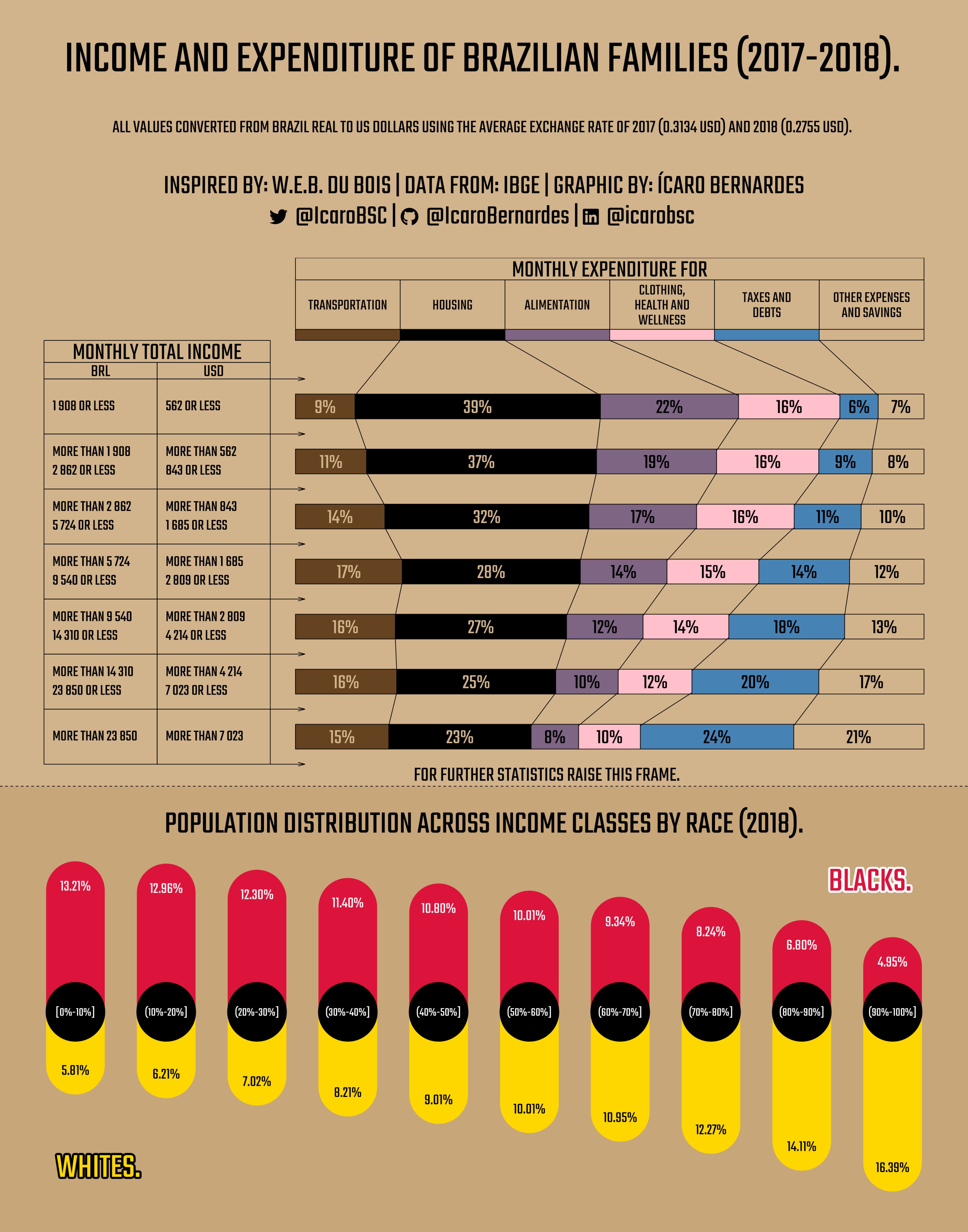
This map for Challenge 4 from Gabriel Zanlorenssi, in which he adapted the portrait to show the enslaved population of Brazil in 1872.
…this entry for Challenge 1 from Beatriz Cabrera using D3, JavaScript, HTML, CSS, Figma, and Google Fonts.

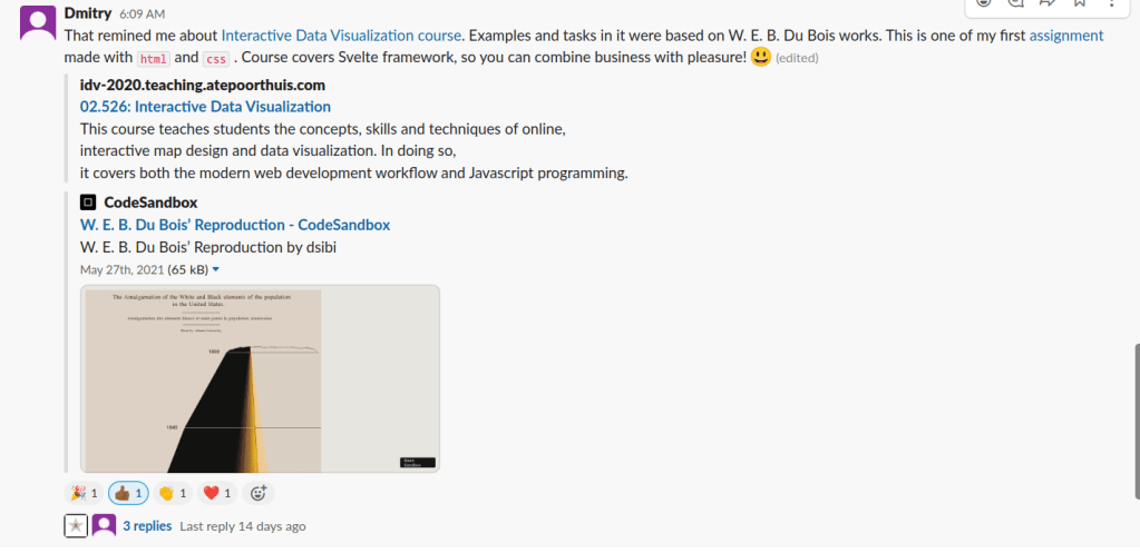
… and this entry from Dmitry in which he uses HTML, CSS and more.
We also had a few participants on LinkedIn (<10). Submissions here were mainly R and Tableau.
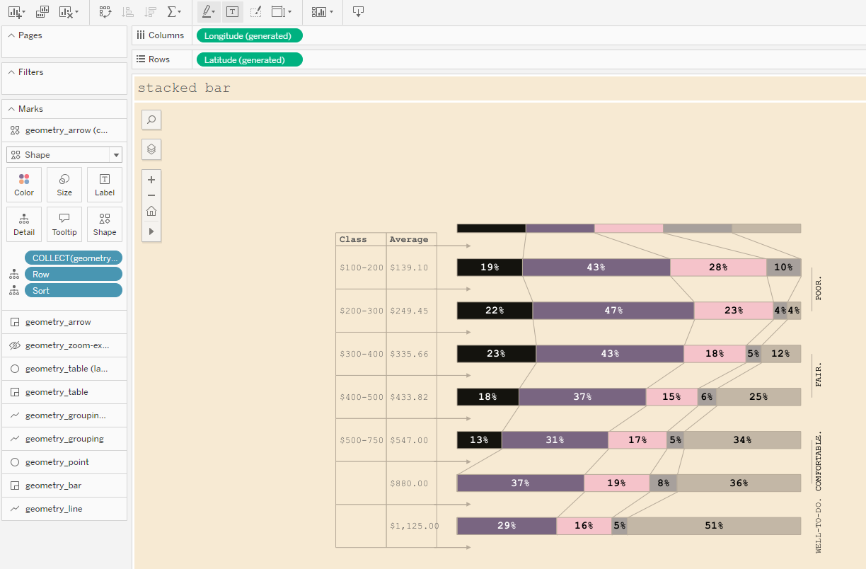
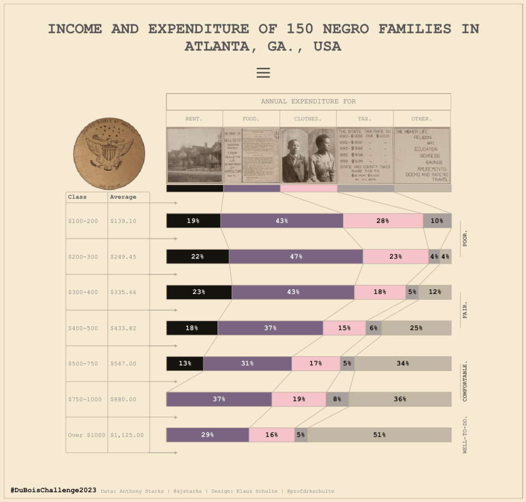
In his entry for Challenge 1 , Klaus Schulte uses map layers to recreate the chart from the original portrait in great detail, down to the lines connecting the bar charts at the different sections.
Last year when I re-created this portrait, I didn’t bother with the lines, so it was nice to see how Klaus implemented them here, and all in a single view at that. Impressive!

A familiar face on LinkedIn actively helping celebrate DuBois’ legacy with his participation was Rashid Minott, who, at some point, we joked was our LinkedIn DuBois Representative.
He had a lot of interesting takes on the portraits, and it was nice seeing them all come together in Tableau.
Here are a couple:
Be sure to check out his submissions on his Tableau Public Profile here.
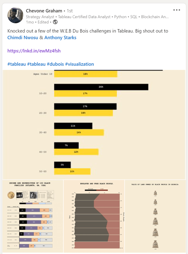
Chevon Graham was an enthusiastic new comer that completed a few, and you can check them out on his Tableau profile here.
The Approaches Taken
While some recreated the portraits with every detail included, some tweaked small details to improve readability. Other approaches were to adapt the data to show current-day stats and to specific geographies.
Participants put significant consideration into the different contributions, and an impressive level of creativity shone through as everyone came together to celebrate DuBois’ legacy.
Some “Full Detail” recreations:
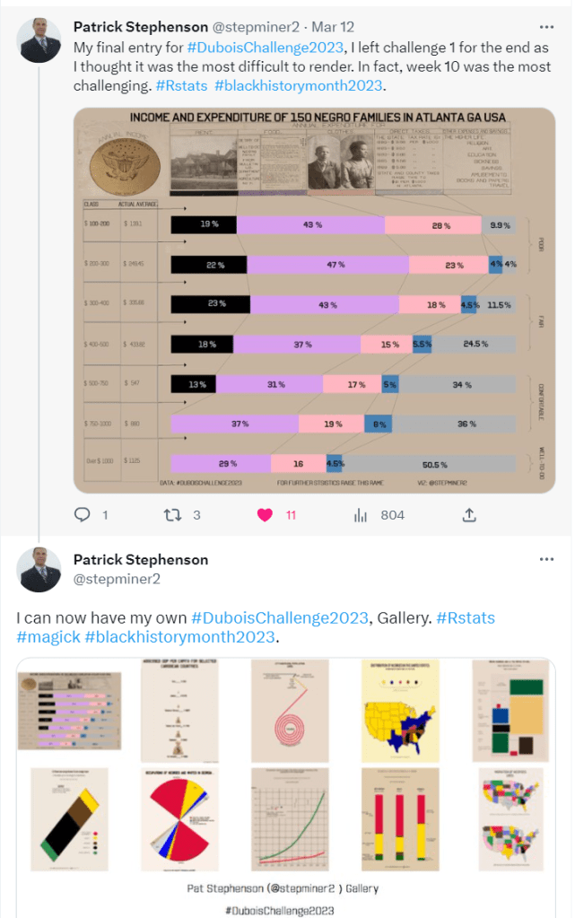
Challenge 05 by Patrick Stephenson using Rstats

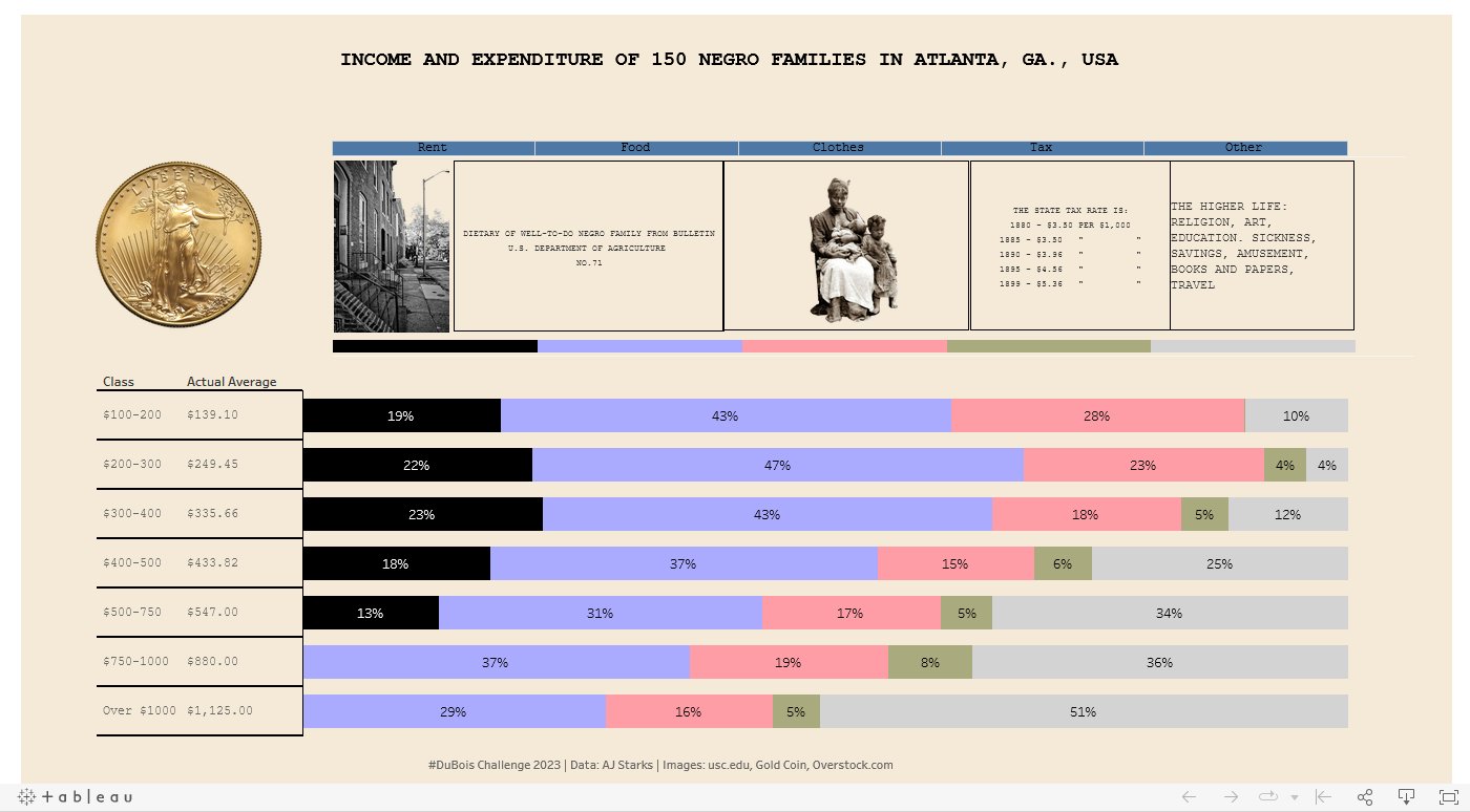
Challenge 01 by Klaus Schulte using Tableau
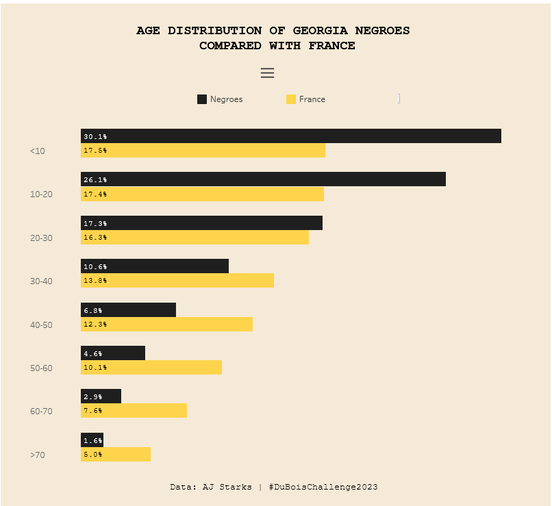
Challenge 04 by Ena (‘Kemi’) Ibeh using Tableau
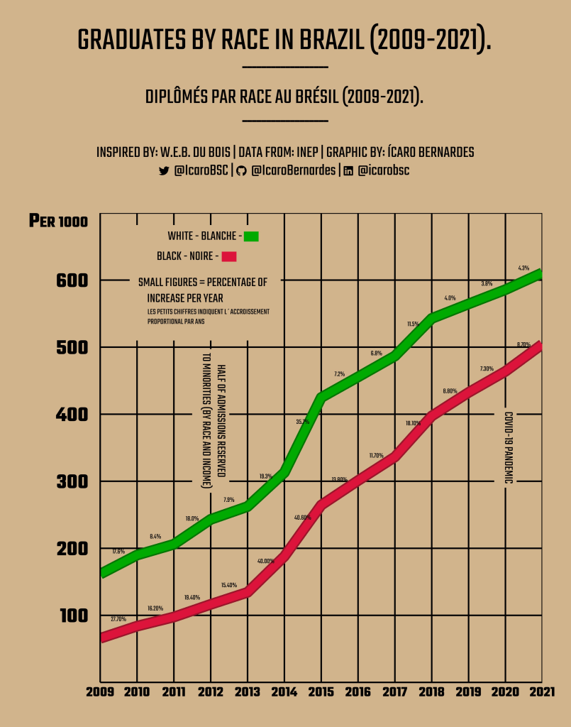
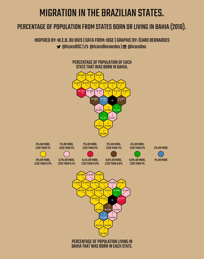
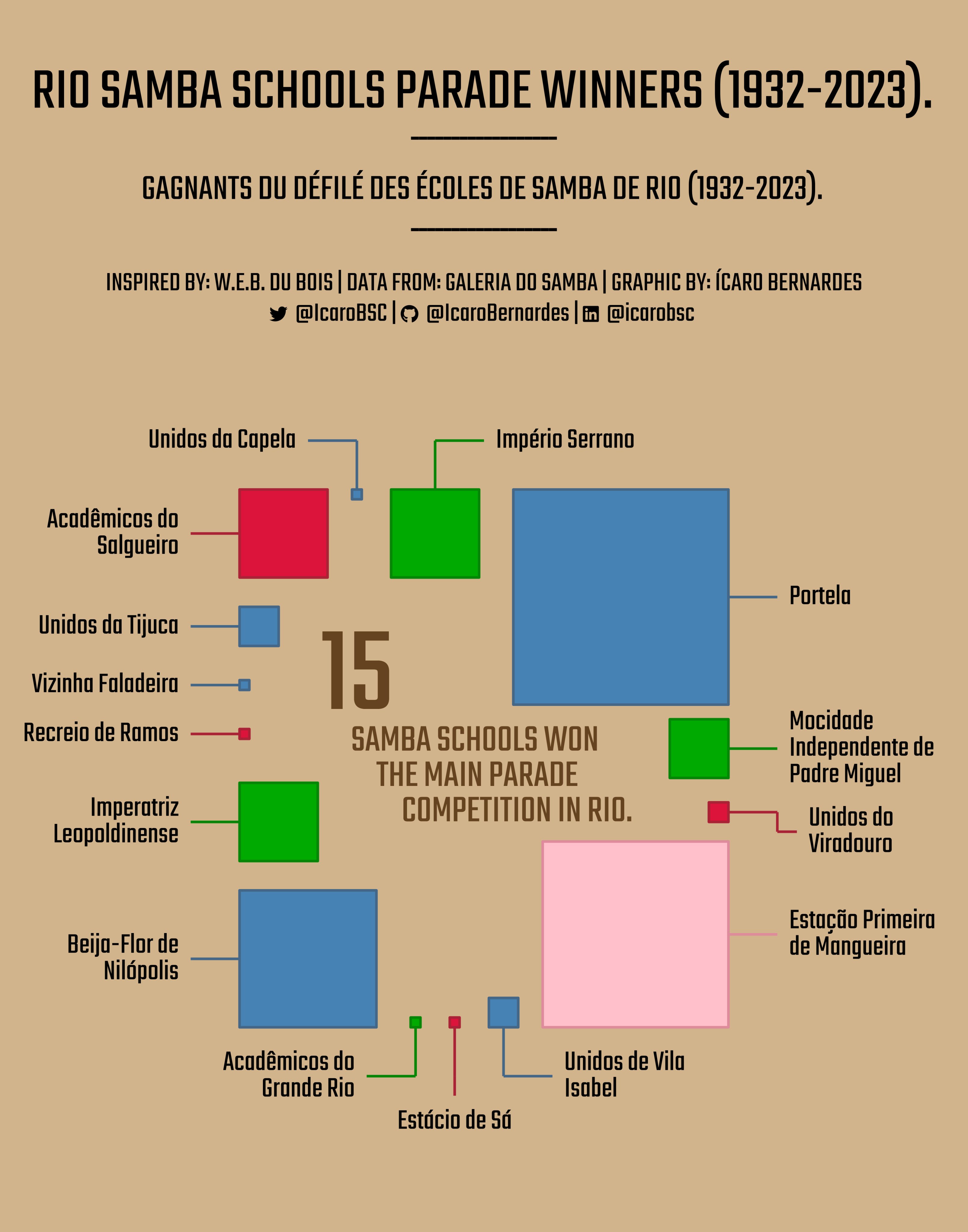
Here are some Geographical Adaptations focused on Brazil by Ícaro Bernardes:

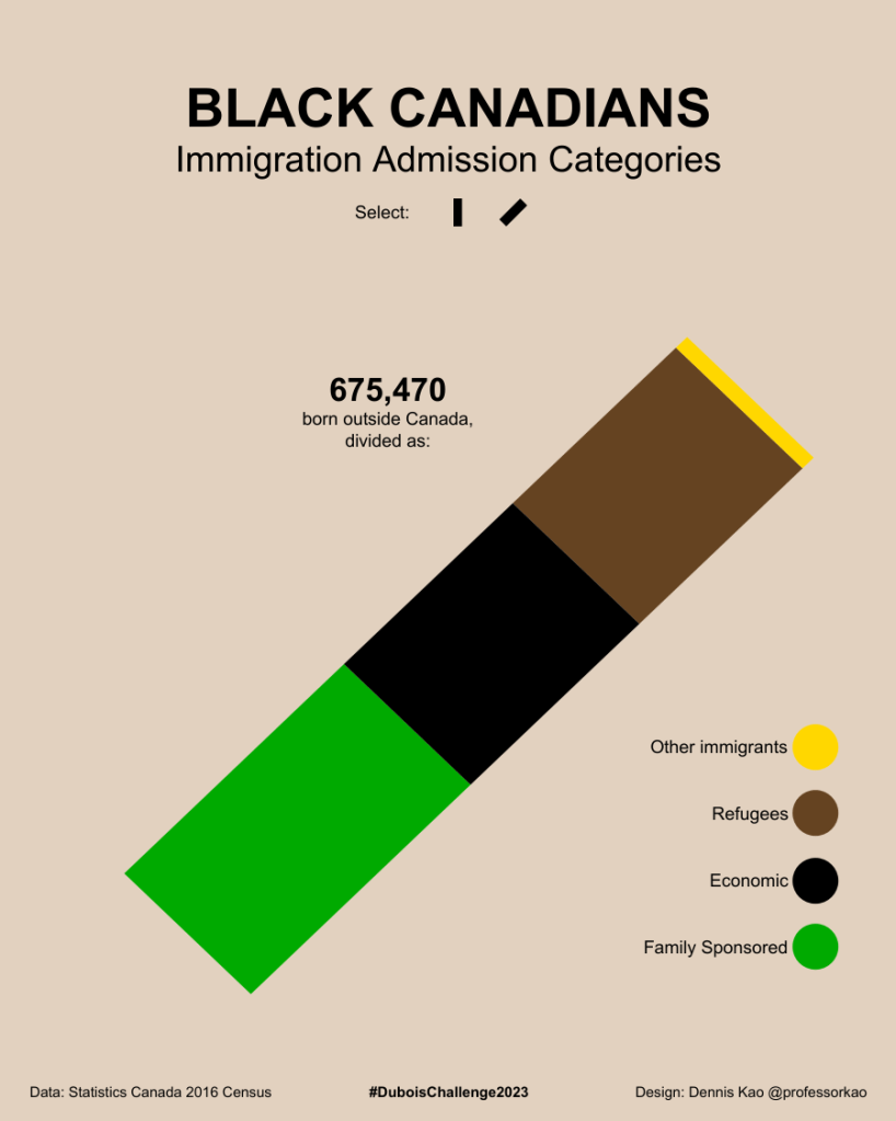
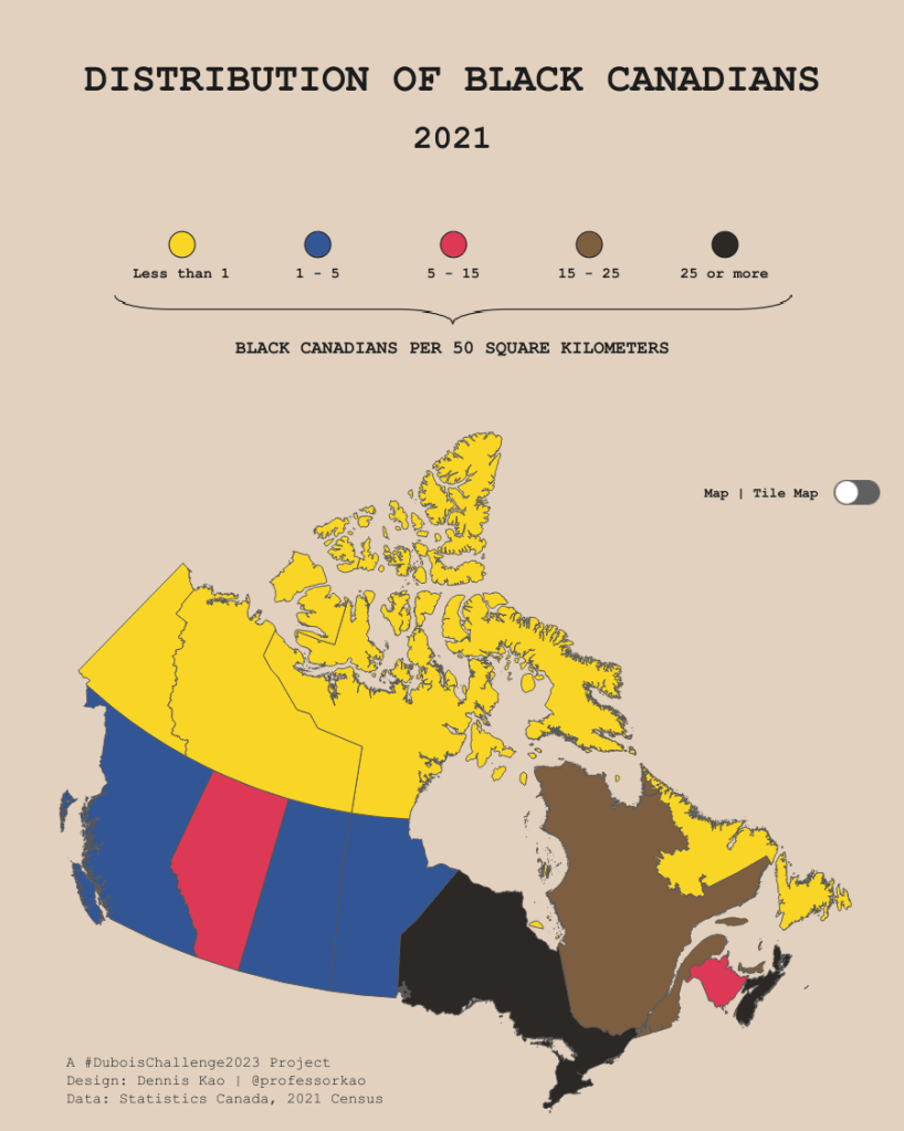
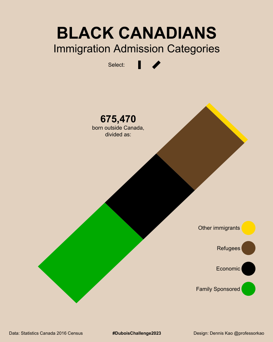
…and some Canadian adaptations by Dennis Kao:
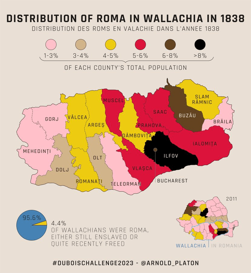
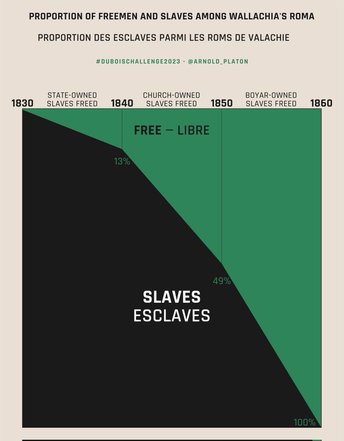
Finally, here we see some Romanian adaptations created by Arnold Platon


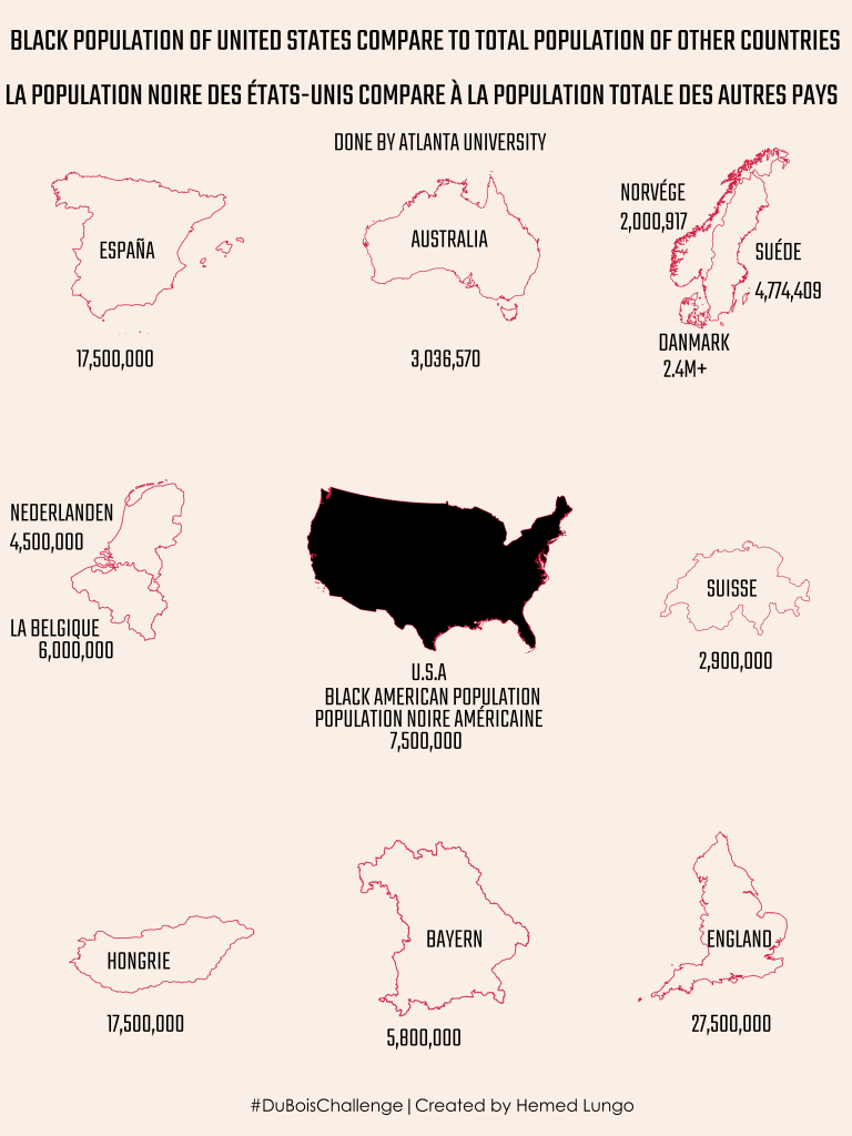
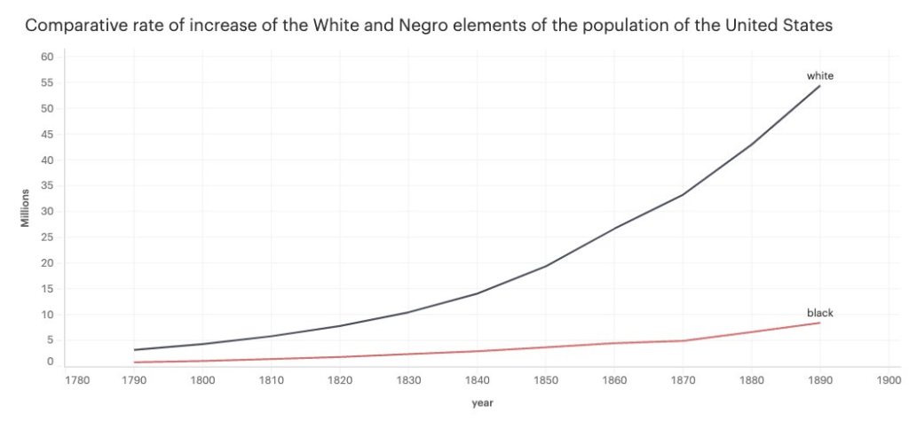
and one that compares the U.S population with other countries, by Hemed
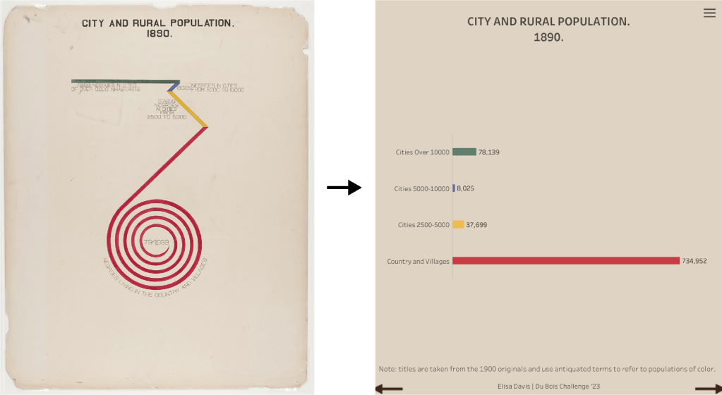
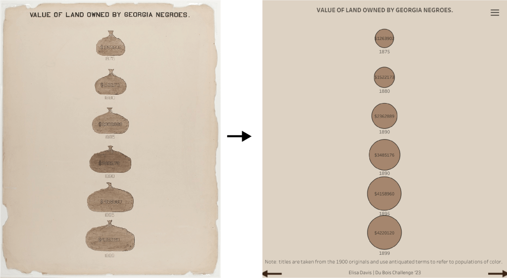
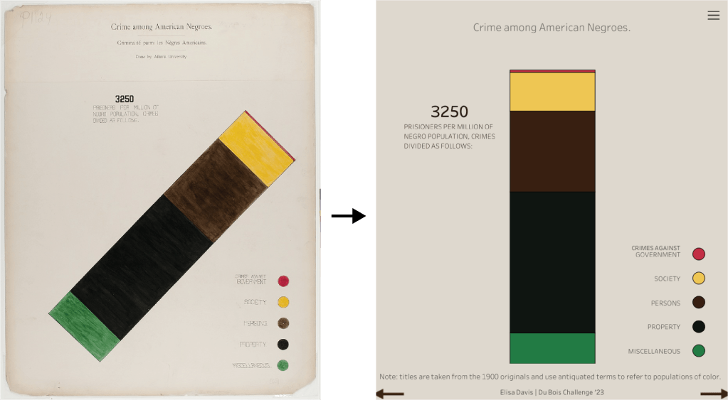
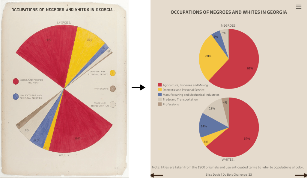
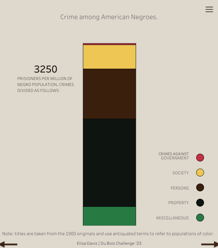
Here, we see a few entries where Elisa Davis tweaked minor aspects of the visuals to improve readability:
You can check out the all her entries on her Tableau Public Profile.
We welcome different tools, techniques, and approaches, and another set of entries with a notably different approach were the entries by Nascif Abousalh-Neto, which he created on white backgrounds, in a more “today style” look as opposed to preserving the more “historical” or “aged” look in the originals.

Mic Drop Category
My 2022 #DuBoisChallenge gallery with 20 DuBois portraits was well received by the community, and we were pleasantly surprised to see a few people take the same approach this year. The hosts showed excitement on Twitter, and after a few back-and-forth jokes, the Mic Drop Category for the #DuBoisChallenge was born.
If you ask me to define it, I’d say anyone who completes the challenge would fall into this category.
Completion in no way elevates them higher than those who did not. However, going through it takes time and commitment, which is worthy of admiration.
Here are the participants that put out contributions for all the weeks:
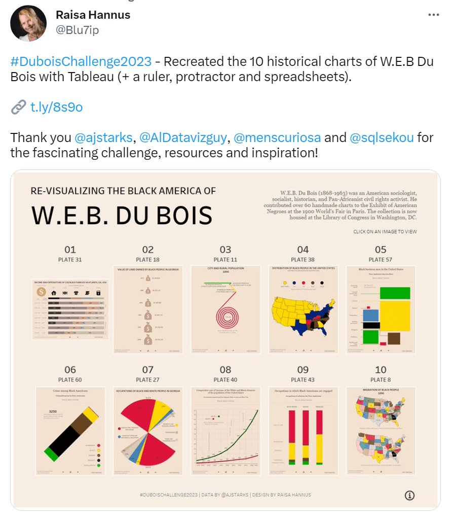
Raisa Hannus
Raisa’s comment in her submission tweet gives you an idea of her commitment to getting it done, and as we can see, the outcome was well worth the effort!
Her Tweet.
ELISA DAVIS
As mentioned earlier, Elisa tweaked a few of the originals in ways that made them easier to see. Witnessing how major tweaks can make a big difference in perception was fantastic.
Her Tweet.

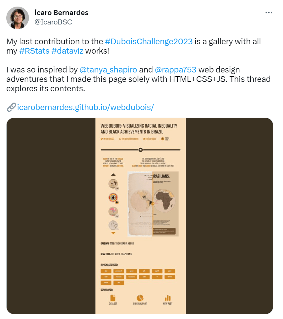
Ícaro Bernardes
Icaro completely blew everyone away with his gallery of DuBois portraits adapted to show the Brazilian experience. He coded the gallery using the tools he mentioned in his tweet and even takes us through the project in this thread— impressive work.
patrick stephenson
Patrick is another participant that took it to the max using code, and despite encountering some hiccups along the way, he persevered through the challenge and got the job done!
His Tweet.
Participants’ Feedback on their Experience
It’s natural for the hosts of an event to feel excitement and enthusiasm around the events they’re involved with. Despite knowing that participants likely share this feeling, we wondered what else participants felt and thought as they created their entries.
To learn about this, we contacted a few participants who were gracious enough to share their thoughts with us.
Here they are:
Elisa Davis

“As someone who runs a community project, it’s important to me to also participate in community projects. Especially when the topics are related to diversity and inclusion. I was inspired by a lot of the work I saw coming out of the DuBois challenge last year and wanted to do at least one or two myself.”
“While I was doing the challenge, I was struck by the amount of detail you notice when you’re trying to recreate something… You really engage with the viz deeply and get to think about the choices that were made when you’re trying to recreate it. There’s a real depth of attention.”
On the whole, I’m most struck by how much more effective the originals are for the charts I couldn’t “get right.” The spiral, the fan, and the tilted bar chart are so much more eye catching and memorable than the same data vizzed more traditionally. I definitely feel a sense of connection to these works now, and a huge amount of respect for the undertaking it must have been in 1900.
Patrick Stephenson
“Although I have not completed all the 10 graphics yet, I can tell you that many participants of the challenge have found it to be a valuable experience in terms of expanding their skills and knowledge in data visualization, as well as their understanding of the important issues of racial and social justice that the challenge aims to address. For those who are passionate about using data to drive positive change in the world, the DuBois Challenge provides a unique opportunity to showcase their skills while contributing to a larger community effort. The challenge is not just a technical exercise, but an opportunity to engage with important social issues and to use data visualization as a tool for advocacy and change”
Icaro Bernardes
“Initially, I took on the DuBois Challenge to hone my dataviz skills in R. As it would be a fun way to do so. When I started, I decided that my main focus wouldn’t be a reproduction of the plots but rather an adaptation of their design to Brazil’s data. Thus, since last year I’ve been making posters that show racial inequality in the country. Currently, I see the Challenge as a way to connect to the African Diaspora around the globe. People who I don’t think I would get to know otherwise. It also is a stage to bring knowledge to people and promote Social Justice. Moreover, I’m always left in awe by the small tricks that the DuBois team used to solve visualization problems. The fan chart is an intuitive comparison tool, while the spirals are a compact way to show huge differences in data.”
Ena Ibeh
“I began my Tableau journey in 2022 and whilst learning the software, honing my creativity on dashboards and vizzes, and integrating myself into #datafam Twitter, I discovered Chimdi’s DuBois gallery on Tableau Public and Twitter and fell in love. The bold colors, the unique chart types (spirals, fan chart etc), and even learning a new DuBois fact (I had no idea he made hand-crafted charts) got me keen to recreate these charts.
Chimdi’s DuBois gallery so inspired me to “do it scared” by trying out the challenge this February despite my imposter syndrome. I’ve completed 4 charts thus far and I’m learning invaluable Tableau and chart tips along the way. I hope to recreate eight charts and challenge myself by including a spiral. This is boosting my Tableau confidence but I’m quite chuffed that within a year, I’ve gone from fantasizing about creating one DuBois chart to actually creating four…and counting.”
Other 2023 #DuBoisChallenge Highlights
These are some of the awesome things that happened with and around the challenge this year:
keynote at the AUC (Atlanta Universities Consortium) on February 24th
AUC held a DuBois Data Science Day called the W.E.B. DuBois Data Science Symposium 2023, and Allen Hillery, one of the challenge co-founders, got to discuss and promote the DuBois Challenge.
Viz of the day on February 23th
Klaus Schulte’s submission for Challenge one displayed enough technical prowess to be awarded viz of the day by tableau.
Veterans Tableau User Group Event on February 22nd
To celebrate Black History Month, the veteran’s TUG hosted an event on February 22nd where Professor Gitre from Virginia Tech discussed a WWII survey that polled Black and White Soldiers on serving together on the same squad. Here is the survey.
In their #VizForVets visualization challenge, one of the datasets used was the famous “Tuskegee Airmen” dataset often used to visualize the story of the Tuskegee Airmen DuBois also visualized.
You can watch the event here.
Fisk University Student Engagement
Allen Hillery and Sekou Tyler have been working with Lena Winfree, an instructor at Fisk University, where she is teaching Machine Learning for Social Justice.
Sekou and Allen teamed up with Lena and her class to discuss the history of W.E.B. DuBois and his data visualizations. They also hosted tutorials on how to use Tableau.
One activity they did was watch my DuBois visualization video library to help them recreate visualizations for this year’s DuBois challenge. They had a fun time, and these are some of the work they shared on Twitter:
Challenge 1 by Diamond

Challenge 1 by Just.Mahnuel
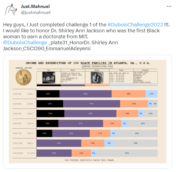
Challenge 1 by Anup Gautam

Conclusion
We’re super grateful to everyone who contributed not only this year but in previous years too. We hope you had a great experience and look forward to seeing you in future and encourage you to continue to explore, engage with, and share DuBois’ work in your own time.
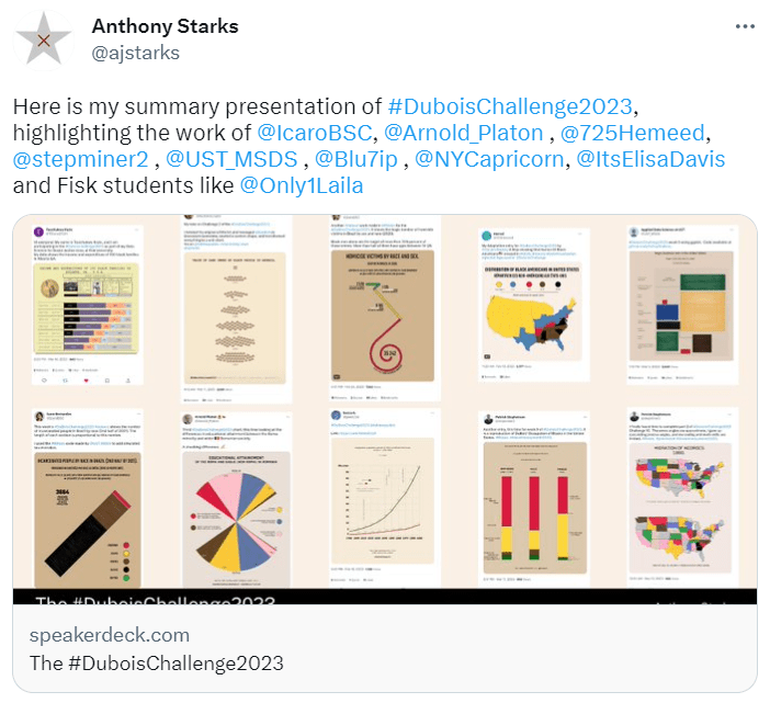
Anthony, one of the co-founders put together his yearly #DuBoisChallenge summary deck which you can check out here.
And once more, here’s our #DuBoisChallenge Twitter Dashboard, where you can check out all the tweets from this year and previous years. In addition, you can look up tweets by dates, participant Twitter handles, and more.

If you would like to engage with and re-create the awesome work of DuBois using available references and datasets, you can check out from Anthony’s GitHub repo.
Finally, here are some more awesome entries from this year’s challenge!


Till Next Time.
Happy Vizzing!
Chimdi and the #DuBoisChallenge crew.
