
For this weeks challenge, we explored the topic of death. Though the focus was more on the causes of death rather than people dying, it’s still a sensitive topic so caution is necessary.
Both the dataset and chart comes courtesy of Our World in Data, and looks at the number of deaths caused by natural disasters over time.

Thoughts on the Original
The original visualization is a basic stacked column chart that shows the decadal average of the 11 categories of natural disasters that caused deaths from 1900 onwards.
The bars effectively display the trend of deaths across the years, and the legend clearly identifies the categories and colors used to represent them.
Challenges & Potential Improvements
Despite knowing there are 11 total categories, I personally only see at most six in the chart. Do you see more?
This illustrates one of the main issues with stacked column charts and why I personally stay away from them whenever there are many categories to visualize — the sizes tend to obscure the data, making it difficult to see individual categories. If we insist on using a stacked format, a percentage of total stacked column would likely work better.
This chart type makes for a more “equal” comparison since the proportions are all relative to a total of 100%, making it a bit easier to identify patterns in the data. Even with a percentage of total stacked chart, the same concept of limiting the number of categories applies. I’d suggest keeping it to a maximum of 5, maybe 6 categories, depending on the size of your chart and how much space it can take up on your palette/medium. If we have more categories that that, combining a few categories into a single one, is a strategy to help limit the overall number.
My Submission
After reading the article, here’s the approach I decided on :
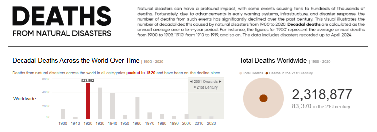
- I explored how death occurrences changed over time, specifically comparing the number of deaths in the 20th century versus the 21st century.
- I broke down the death occurrences across different dimensions in a hierarchical fashion, starting from the top level and moving to more detailed levels: Worldwide > Regional > Countries/locationsns.
Given the volume of information, I aimed to utilize charts that were easy to understand and not overwhelming.
- Column charts were used to show the trend, with colors purposefully highlighting the peaks of death occurrences across the two centuries mentioned

- Sized circle shapes were used to highlight the variance in occurences across both centuries.

- A tile map was used to show each country/location individually since a standard filled map or shape map didn’t adequately highlight differences due to China having relatively more deaths than other countries. I created a color legend to illustrate a pattern on the map and added a tooltip to show the trend for each location.
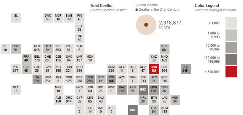
A bit of filtering and interactivity was added and I recommend checking out the interactive verison to get the full experience which is better than anything I can share on here.

Community Contributions
These are some of the approaches taken by participants in the community this week:

Muhammad tends to focus on creating clean, simple-to-understand visualizations, and he has applied the same approach here. He added some interactivity, allowing the viewer to delve deeper into the insights.
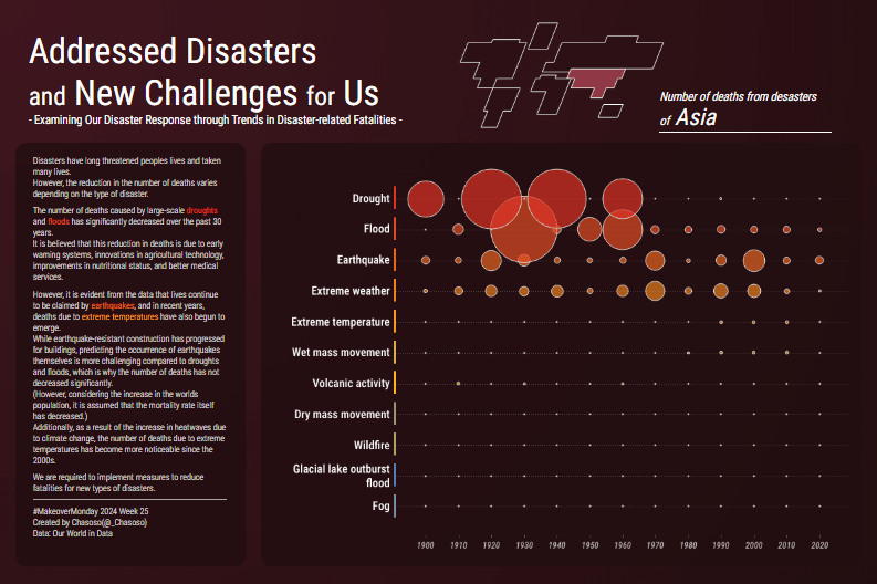
Hideaki (Chasoso) focused on Asia, which had the highest number of death occurrences, by highlighting the trend of deaths across different categories. When dealing with a lot of data, a good approach is to narrow down the analysis to a single point or story, and that’s what he has done here.
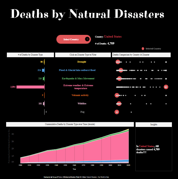
Shangruff highlighted deaths by disaster categories, countries, and cumulative death counts. He also added some interactivity that allows the user to explore the countries and deaths from disasters in each category as deeply as they want.

Kawaljeet had another interactive submission where she utilized varied chart types to analyze the numbers of deaths across different dimensions. She also included the income distribution dimension, which was not commonly seen in many submissions.
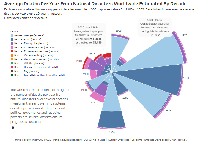
Sybil utilized a coxcomb chart, which is somewhat similar to a stacked bar chart. In this chart, the size of the wedge shows the magnitude of deaths across the years, and the stacking shows the different categories. It seems Sybil understood the challenge of seeing all the categories clearly, as a tooltip with the complete breakdown of each category for each year was added to provide full details and compensate for the obscured data.
There were other interesting approaches we saw, but we’ll cover just these in the interest of time.
Conclusion
When it comes to determining the “right” approach, there isn’t a one-size-fits-all answer. However, here’s something to consider:
As the creator or designer of a visual, what you’re trying to show and communicate is likely very clear to you. But what happens when you share the same visual with a fellow data professional? Do they understand it as well as you do? And what about someone without a data background— do they grasp the insights too?
If the goal of data visualization is to highlight and communicate insights, then ideally, the answer should be “yes” for both groups beacsue achieving clarity and comprehension across diverse audiences is a key measure of success when it comes to data visualization. A little food for thought as you approach your next #MakeoverMonday challenge.
Thanks for reading, and see you next time!
