

#VizReviewLive Week 1
Welcome to Week One of VizReviewLive!
Tableau Ambassador Zainab Ayodimeji and I are thrilled to officially launch this project. We created #VizReviewLive as a dedicated way for you to receive feedback and level up your data visualization skills. (Don’t worry, we have shared a link with more information at the end of this post!)
As we reviewed this week’s submissions, a clear pattern stood out. We saw plenty of solid analysis and powerful insights, but often, the design wasn’t letting that hard work shine. That is exactly why we are here.
Our goal for this week is simple: To build the foundation that communicating with data requires more than just good numbers or analysis. Good design is a requirement.
To help us all get there, here’s a list of five principles every analyst, designer, or developer should consider when sharing data insights. Whether your final product is a business dashboard, infographic, or report, these practices will help your visuals inform, persuade, and resonate.
1. Clarity Starts with Text
We should use text sparingly but effectively. Ask yourself: Can this message be understood without me stepping in to explain it?
Here are quick Tips to enhance clarity with text:
- Use Descriptive titles that summarize the takeaway.
- Use Subtitles to add more context.
- Use Annotations & Labels support the narrative and improve understanding.
- Use Subtitles to add more context.
We want to help viewers interpret key points with ease.

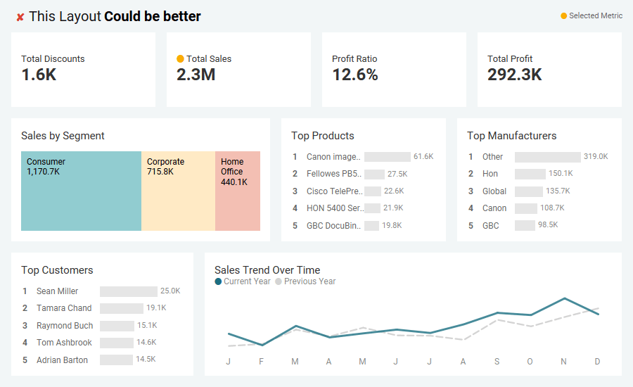
2. Good Layout = Better Understanding
Our eyes follow natural reading patterns. For dashboards and reports, Z-layouts and F-layouts can help structure information effectively, for example. Since attention is strongest at the upper left, its helpful to place your most important information there.
Quick Tips:
- Use white space to amplify focus.
- White space isn’t “empty” space. It’s design breathing room that leads the user naturally from one insight to the next.
- Keep spacing, alignment, margins etc. consistent throughout.
- Group related visuals together to strengthen interpretation.
A strong layout should naturally guide a user along the view.

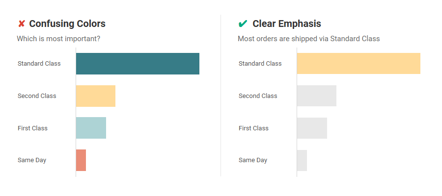
3. Color Is Communication, Not Decoration
Color should clarify meaning, not distract. Every single color on your dashboard should have a job. If it doesn’t serve a purpose, remove it.
Quick Tips:
- Check for colorblind accessibility.
- Use greys and muted tones for background data and let your highlight color direct attention. Use it for key data points and story highlights.
- Fewer colors are better than more.
4. Choose the Right Chart (and Keep It Simple)
Every dataset tells a different story, and the wrong chart hides the truth.
Choose chart types that match your message e.g. bars for comparisons, lines for trends, scatterplots for relationships.
Quick Tips:
- Simplicity Builds Trust: Complex charts tend to confuse more than they impress.
- Use a Reference: When in doubt, a chart reference guide (like the Visual Vocabulary by Andy Kriebel) is an invaluable resource.
- Design Clarity = Analytical Credibility.

5. Aim for Immediate Insight
A strong visual should be understood in seconds.
For each viz we create, we use principles like color, size, and placement not just to make it look good, but to reinforce our main takeaway.
If our design works, the takeaway will be obvious.

Conclusion: From Insight to Impact
The power of your analysis depends on how clearly it’s visualized. Small refinements…better text, cleaner layout, intentional color and chart choices etc. can elevate your visualization from “seen” to “understood.”
We hope these quick tips support you in your quest to influence action with data. See you next time on #VizReviewLive.
Here’s a Notion page with details about #VizReviewLive for those interested.
