
Hey All! This week we have a #MakeoverMonday X #SportsvizSunday collab – shoutout CJ Mayes and the team for bringing some sports energy this week. By the way, you should totally check out the Sports Viz Sunday round-up from CJ this week to view more awesome sports + Tableau content.
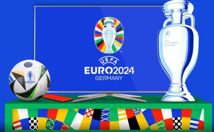
For this week, we get to explore stats from the 17th UEFA European Championship hosted in Germany. It has been on since June 14th, 2024, and runs for about a month. Personally, I’m not that into sports—highlights, reels, and a love for team jersey designs is all I can commit to. BUT…I’m fully aware of how big this football (or soccer for the Americans) tournament is, and how excited some people are for it, so it wasn’t difficult to tap into that energy for this week’s #MakeoverMonday.
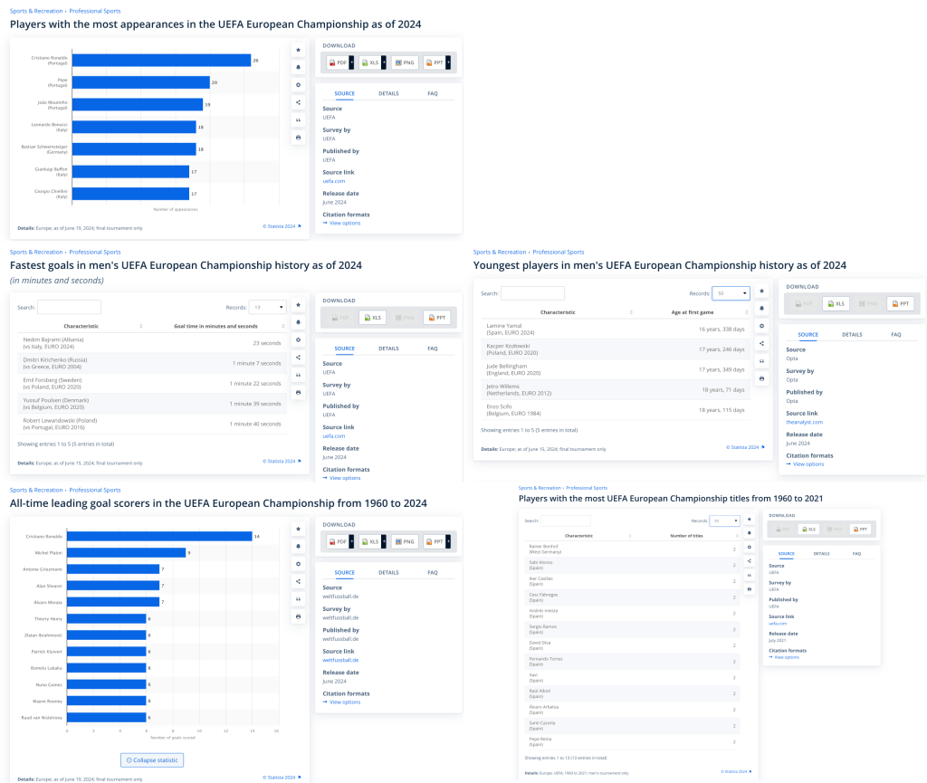
Both the dataset and charts come courtesy of Statista this week.
Thoughts on the Originals
The original visualization uses mainly basic bar charts. Though many people get bored with these, to me they’re like the super-dependable chart type that you can always count on to visualize any data that involves ranking. Though we all like to flex our data viz muscles from time to time, sometimes a good sorted bar chart is all you need.
Challenges & Potential Improvements
You might have guessed this, but I found nothing wrong with the charts—perhaps those plain tables could have also been bar charts, but that’s about it. There are obviously many other ways this data can be shown, but I went for the low-hanging fruit this week.
In my opinion, the challenge is more along the lines of improving the layout and presentation of information, capturing viewers’ attention, etc.
As usual, there were quite a few creatively done submissions from the community which we’ll get to in a moment after a quick rundown of my approach.
My Submission
Here’s the approach I decided on :
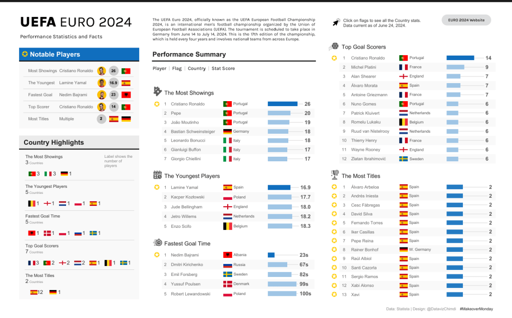
- I kept the bar charts and added a bit of design to them by using color to highlight the top of the list. Rather than putting labels directly on the bars, I used a styling technique I first saw done by Pradeep Kumar, where the labels line up perfectly on the right-hand side of the chart via thin lines extending from the bars. This makes it easier to read since we don’t have to visually follow the length of the bars to get the labels, and the labels are far enough from the bars to not obscure things..

- To help people connect more with the data, I added country flags so people could quickly identify their countries or countries of interest.
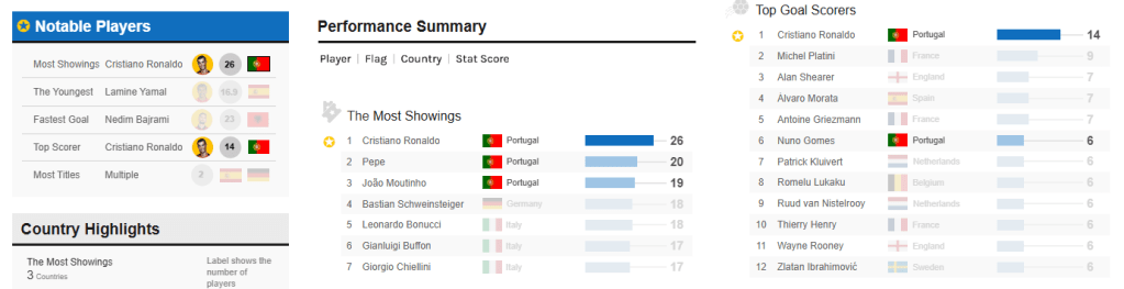
- I added a “Notable Players” section, which shows the top names in each stat observed and identifies them on their respective stat lists using a symbol.
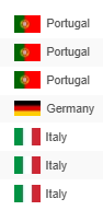
- I included a country summary to show the players represented across each stat, plus a click action that highlights all the stats for each country. This way, you can easily see all a country’s stats together (Portugal stats shown below).
- To tie the information together, I added a small intro summary so people know what they’re looking at, and a button that takes people to the UEFA site in case they get more curious about things.
As usual, I recommend checking out the interactive version to get the full experience.
Community Contributions
These are some of the approaches taken by participants in the community this week:

Ojoswi kept it simple and clean by giving an overview of the Top 5 across the stats and adding some cool visual elements like player photos and soccer balls at the end of the bar charts. Something cool about his submission is that he leveraged feedback from some community leaders to improve the initial submission. He has a quick LinkedIn post about it here.
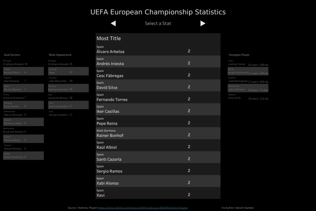
I love Satoshi’s submission so much. It’s a carousel style viz that cycles through all the different stats and presents the data in table form. The dark mode is a nice touch and the interaction is easy to use. Though this looks simple, you’d need some solid tableau technical know-how with actions and parameters to get it together.
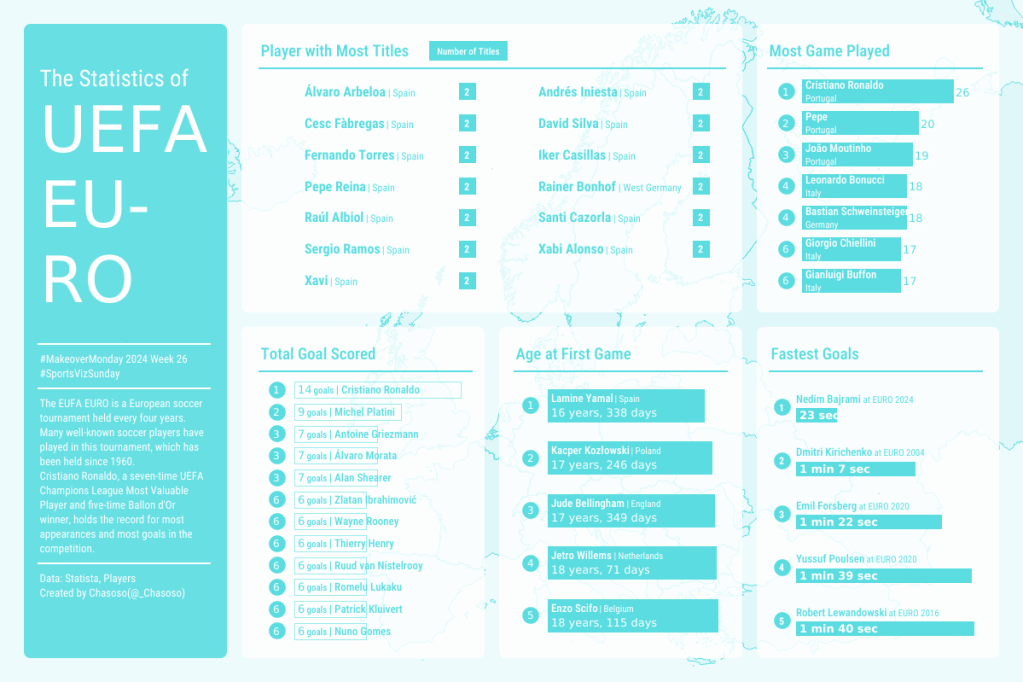
Another cool submission from Chasoso this week. The design is quite nice with the single color theme, and even though he kept it simple with the bar charts, I think its interesting how he varied the types of bar charts used. Though I tend to favor utilizing the “styling/format” when using the same chart type throughout a viz, I think varying the styles of bar charts works here. The info is simple enough that it won’t require much more effort for a viewer to see the insights.

Shangruff presented the info in the style of an interactive dashboard. I think keeping tabs limited to one stat per view allowed him to experiment and play around with unique visual ways of representing the data, while having the stats clearly labeled to ensure the info is still carried across clearly. The player pics are a really nice touch and takes the players from being just names on a board to people who we can celebrate and follow along with should we choose to get more into the tournament. The UEFA theme was also a nice touch.
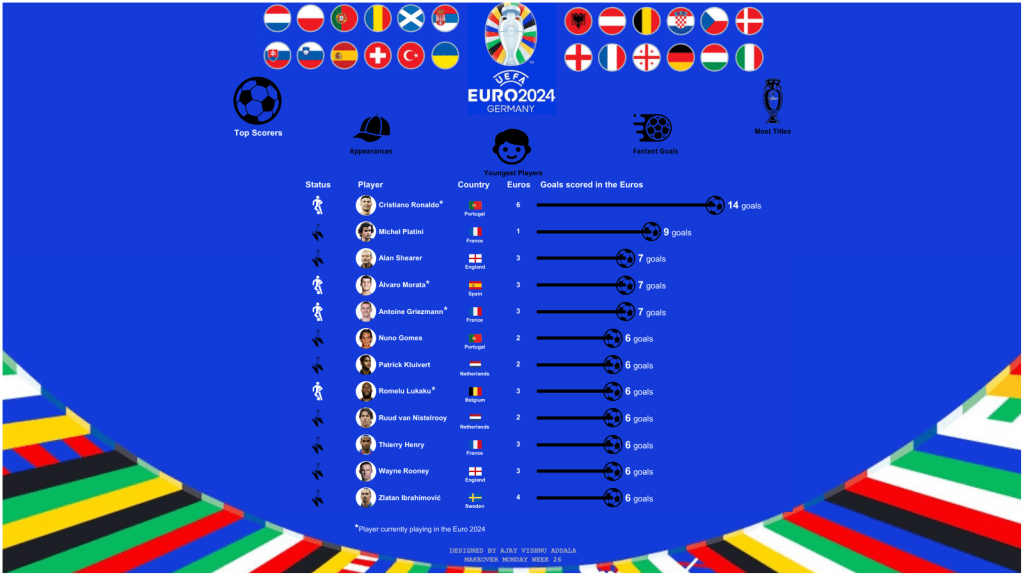
Ajay brought a “fun-style’ interactive viz for us this week. Its another carousel style viz and Interacting with it, you can tell a lot of effort went into it, and that deserves respect. The country flags, the player images, icons, the tool-tips, etc. are all leveraged in a way to really visually highlight the information. The UEFA theme + extra detail about the player status is a nice add-on too.
Conclusion
After doing your analysis and deciding on your charts — the next step is probably the most crucial: How will you show the information?
There’s an unlimited number of ways to do this depending on what your overall goals are, who the audience is, and what the subject matter is. The way to approach this will obviously be different depending on the setting. For example, in our professional careers, most of this will be driven by requirements and users. Or at least it should be, if you want to build something that people love and use.
#MakeoverMonday, on the other hand, is open grounds for experimenting, so when looking at submissions, it’s rare for me to say something is ‘bad’ or ‘good’. If you were to ask me for feedback, I’d first ask you things like who your audience is and what you aim to deliver for them. As long as you have thought about it and can articulate what went into your work, then it’s easier to evaluate it based on that particular context.
And that’s the message for this week—think about the goal of your work and how you want the user to receive the information you’re putting out. Be able to justify all the decisions that have gone into it. There are other things that would ideally come into play here, like user testing and development iterations post-feedback, but these are discussions for another day and not the goal for this post.
Thanks for reading, and see you next time!
